
My Roles
UI/UX Design
Tools I Used
Figma, Adobe XD, Adobe Illustrator.
Defining the Problem
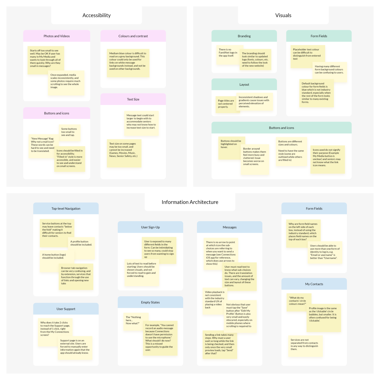
The FamliNet webapp had inconsistent layouts and was confusing to use. It was originally created for tablet and desktop use, there was no mobile functionality in place. On smaller screens, icons and fonts were difficult to read. The webapp contained many inconsistencies, such as colours, fonts, iconography, buttons, and content alignment.
Constraints
Due to pre-existing limitations on the technical side, the app hierarchy could not be significantly changed. New layouts could be created for new features, however, the general structure of the app needed to remain the same.
Solution
Redesign the webapp. Update the branding, improve consistency and overall visual design. Create an accessible and versatile design system. Create an iconography system optimized for mobile devices.
Process
Over a period of two years, I collected observations and users’ responses to the app, and wireframed solutions. User testing sessions with seniors revealed specific insights around certain functions of the app, such and sending and playing back video messages.
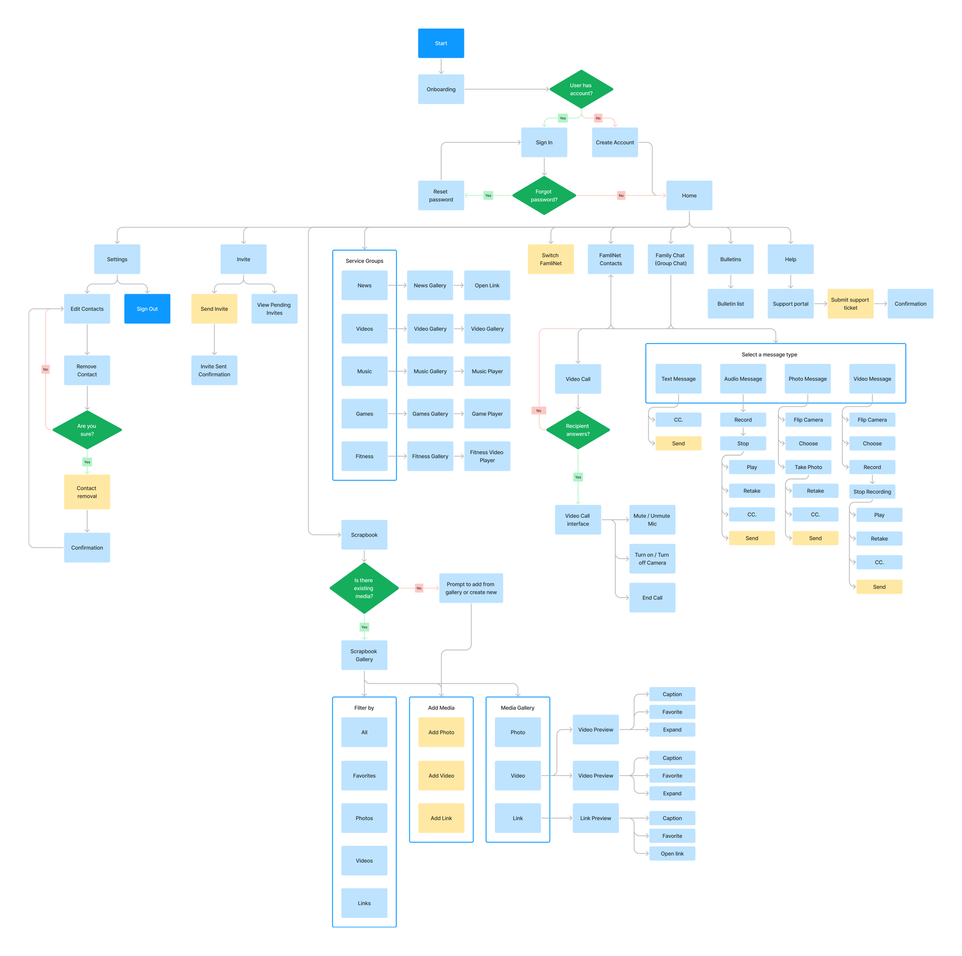
I started by mapping out the existing user flow and visualizing what could be modified, and where the new proposed features could be added. This helped to lay the foundation for the structure of the app. I then started to design the mobile wireframes for the webapp in XD (later migrated to Figma). Once we had a newly refined look and feel I started to design the remaining screens into a high-fidelity clickable prototype.
User Flow
I created a user flow diagram containing the current and future planned features to visualize the main processes.
Interactions
Since FamliNet is commonly used by seniors who have often never used a computer before, it was paramount to focus on accessibility and simplicity when considering interactions.
The strategy for all interactions within FamliNet was to focus on simpler interactions, such as tapping/clicking once, and scrolling on one axis (up/down). We avoided using more complex interactions (such as the need for holding down a button, or dragging or scrolling in multiple directions).
From our research and testing, we found that our seniors using technology for the first time found it helpful to be able to read button labels to understand actions when navigating FamliNet. All buttons within FamliNet have a consistent appearance, and are accompanied by a label to accommodate this.
Wireframes
I created wireframes focusing on mobile layouts, since FamliNet was only available for tablets and PCs at the time. Here are some of the main additions. Through testing, I made some major changes to the existing flow as well: modifying the My FamliNet page to list all contacts at the top (rather than having services first), allowing messages more horizontal space on mobile, and adding a filtering option in the Scrapbook.
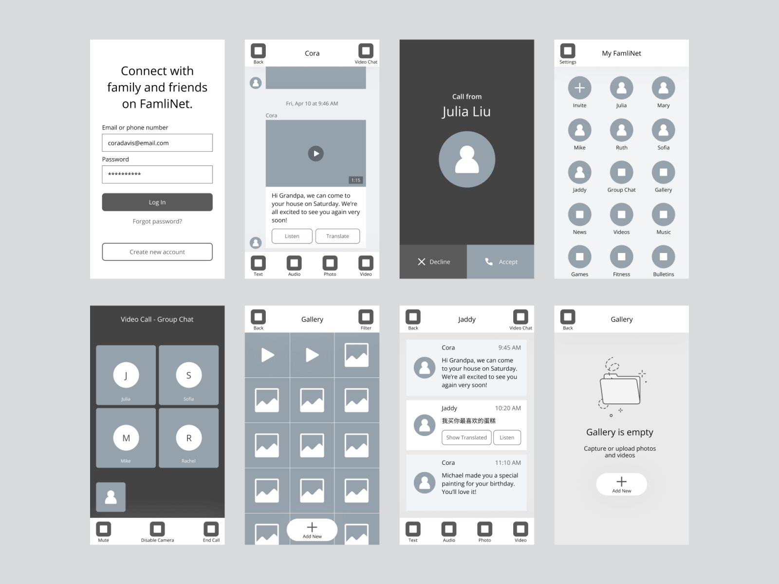
UI Mockups
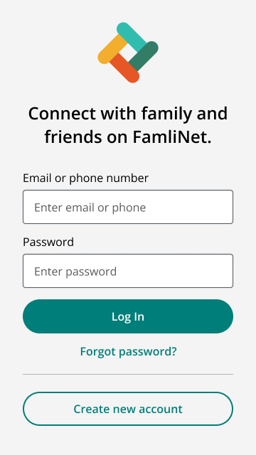
Log In, Home, Invite
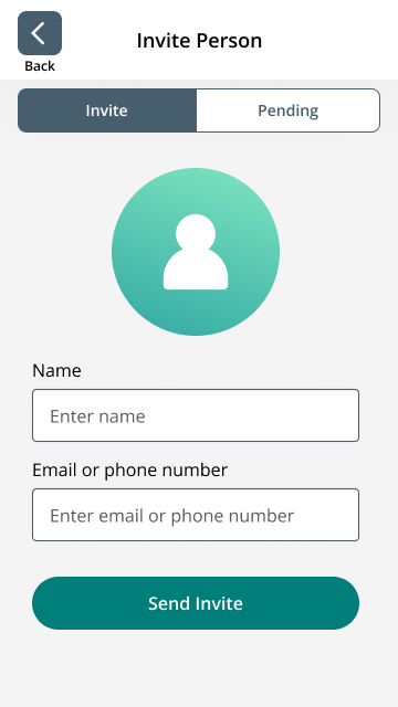
After testing with and providing technical support to seniors, most of which were in their 90s, we found that it was common for them to not have easy access to their email address – if they had one. Most seniors in this group did not own a personal computer or smartphone.
However, all seniors we tested with had access to their own phone, which was a landline in most cases. We made it possible to sign up using a phone number as a primary point of contact with our support team and for account management.
The Home page consists of contacts at the forefront, with large images for each contact and colourful icons with each system group. The large images helped with identifying content, rather than displaying contacts in a list.
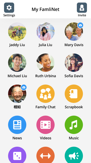
Messaging
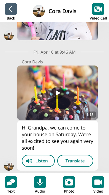
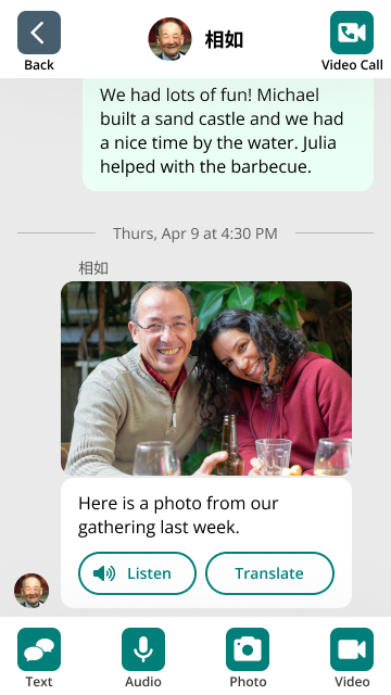
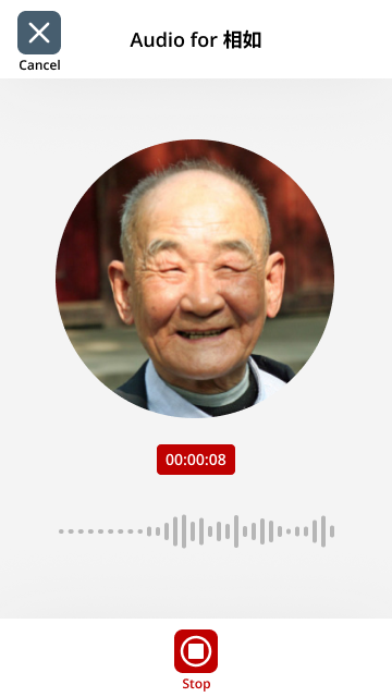
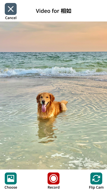
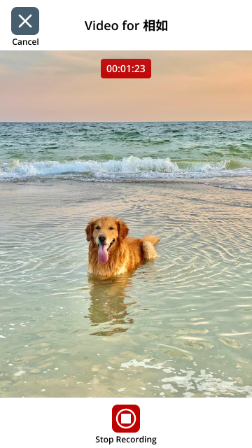
The core of messaging in FamliNet lies in accessibility. Messages in another language can be listened to and translated with one tap or click. This is important especially for older seniors, as it allows them to easily find and utilize this functionality with a single tap.
Users can send one type of message at a time, with each type categorized into Text, Audio, Photo, and Video. This helped seniors to focus on completing one action at a time, while maximizing the screen real estate for each purpose and minimizing the type of interaction needed to only a tap/click.

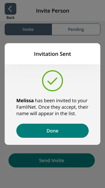
Invite FamliNet Member
To eliminate spam, an individual FamliNet is an invitation-only network.
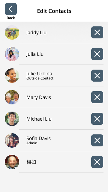
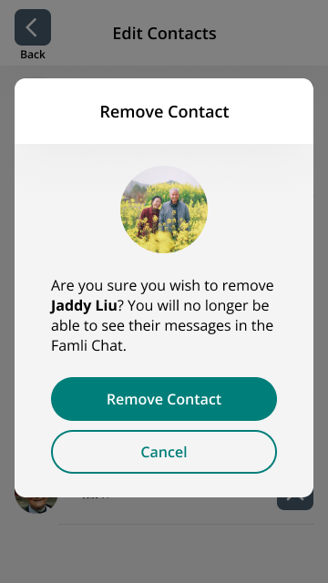
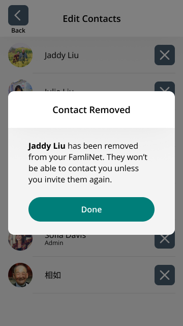
Edit Contacts
Removing a contact removes them from a FamliNet. Everyone in the FamliNet sees this as a notification in their Bulletins.
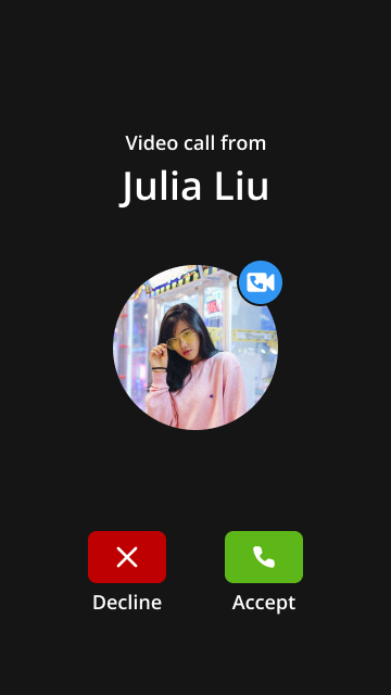
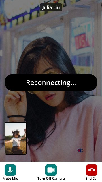
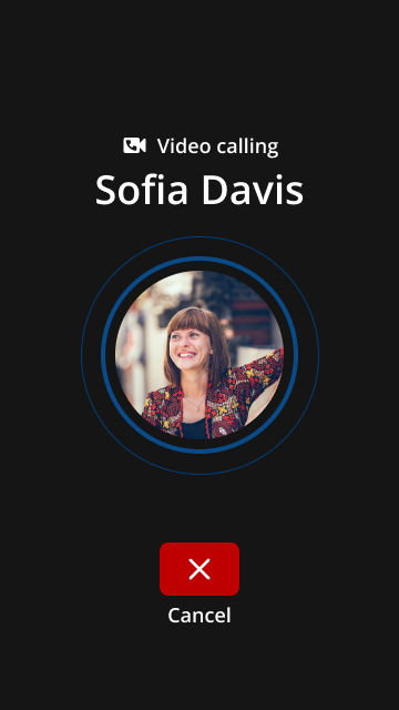
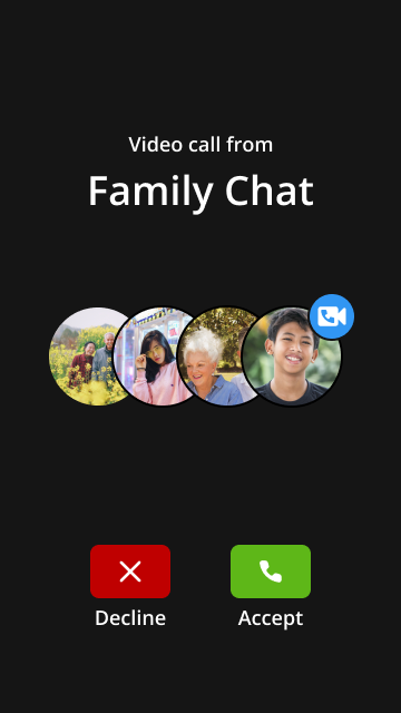
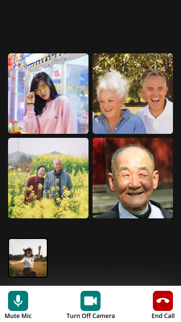
Video Calling
The video call format follows that which is similar to all other screens, except that there is no back button. The ‘End Call’ button is displayed in red as a way to clearly communicate the functionality.

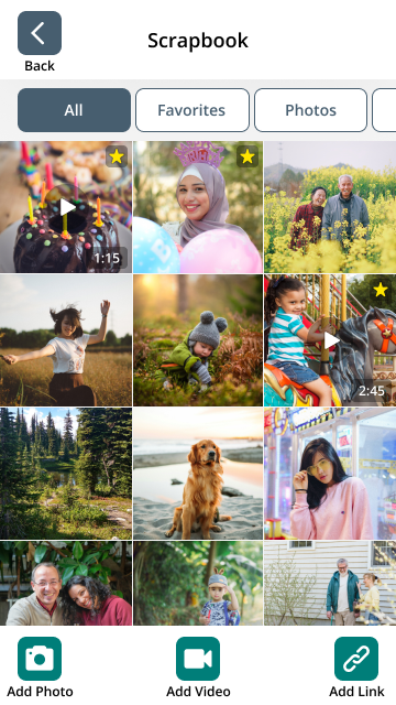
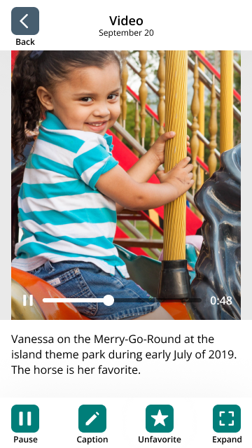
Scrapbook
The Scrapbook is a library where all images, videos, and links sent by the user, to the user, and within group chats are stored. Captions can be added to contextualize photos. Users enjoyed being able to reminisce and catalog their memories shared within their networks.
Additionally, favoriting media allowed users to quickly find their favorite memories. The senior groups especially enjoyed this new addition.
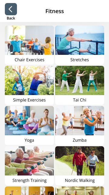
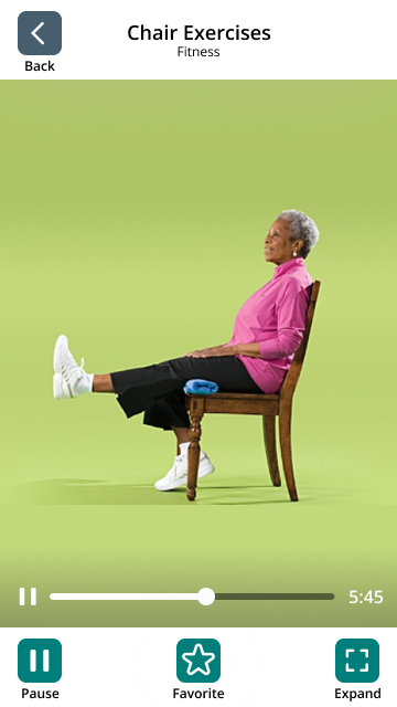
System Groups
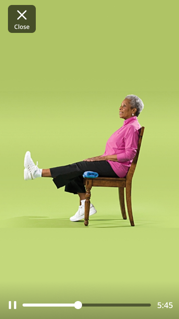
System groups refer to the groups of content provided by default when a FamliNet is created. They consist of News, Videos, Music, Games, and Fitness. Due to technical limitations at this time, they all share the same general structure – a grid of cards with a preview image and title.
Icons
I created all the icons below for use throughout the FamliNet App. The icons were created in Adobe Illustrator, and set up as a system of reusable components in Figma.