My roles: Data Visualization, Web Development
Tools I used: HTML, CSS, JavaScript, Tableau, Adobe Illustrator
Meteorite Landings is a web-based interactive visualization of meteorite landing data from NASA. Built with Tableau, d3.js and planetary.js.
For this solo personal project, I was inspired by different map projections. I wanted to take a look at a form of earth-space data and display it without the projection being warped. The end goal was to create a ‘globe’ interactive visualization where users can zoom and rotate the map. I looked at various datasets on kaggle.com, and one I came across was an older version of NASA’s meteorite landing database.
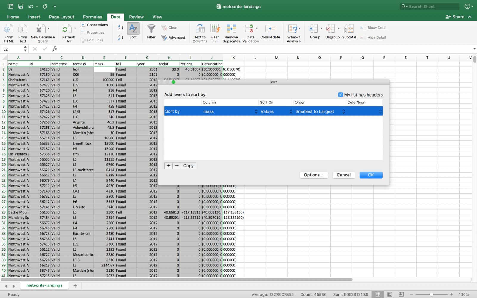
Upon opening the .CSV file in excel, I was surprised by the variety of different types. Saving it as an .xslx file allowed me to open it up with Tableau Public. I experimented with moving different fields around (such as viewing how many meteorites were logged in each year) and by type.
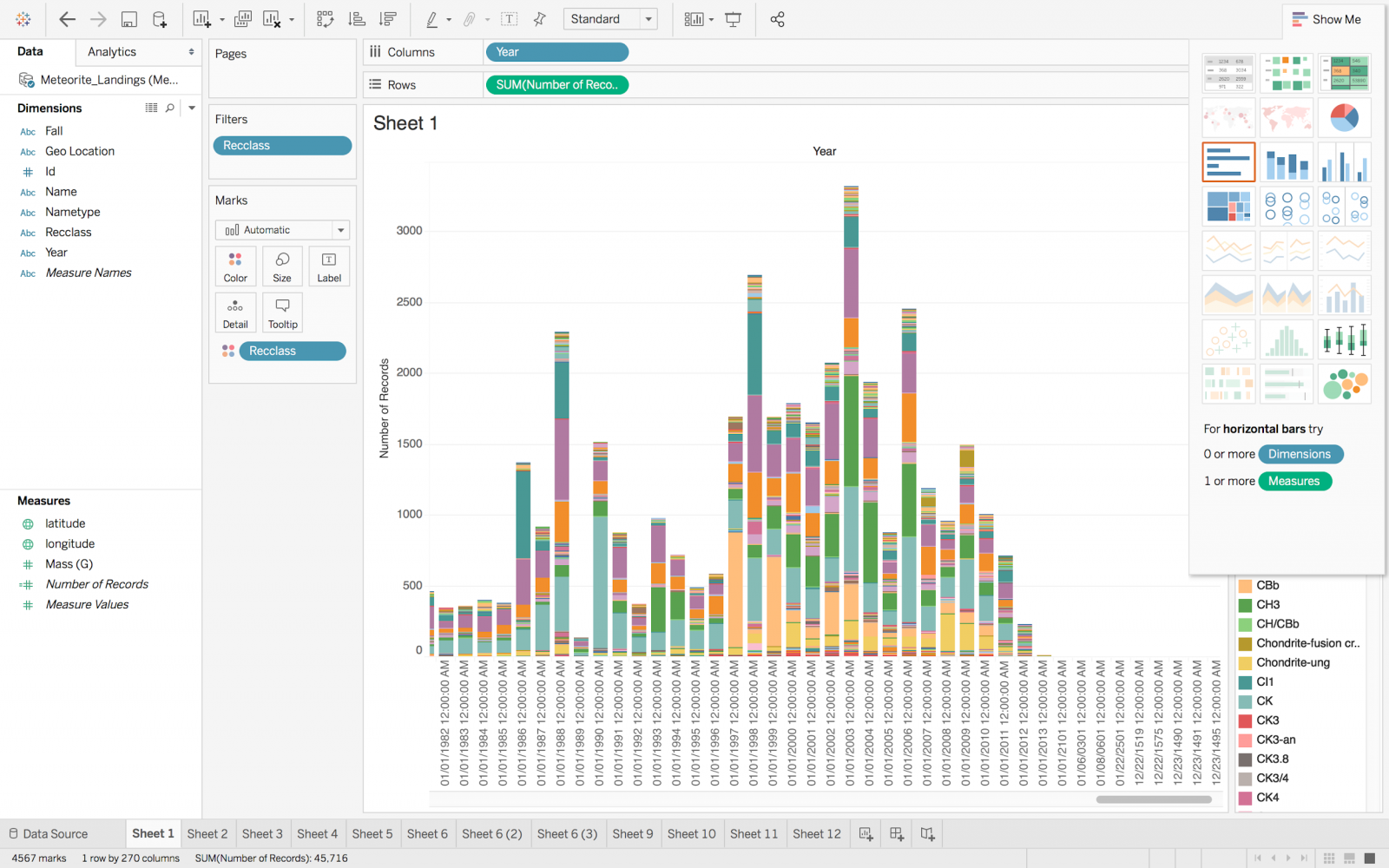
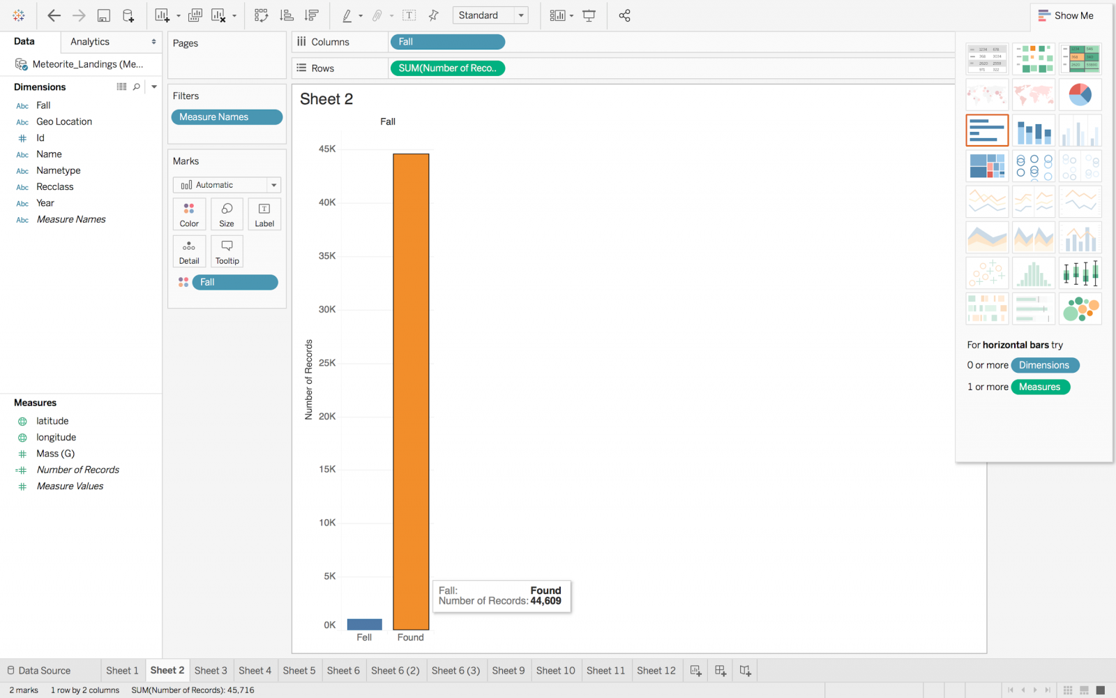
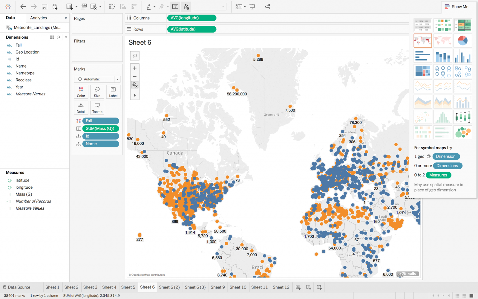
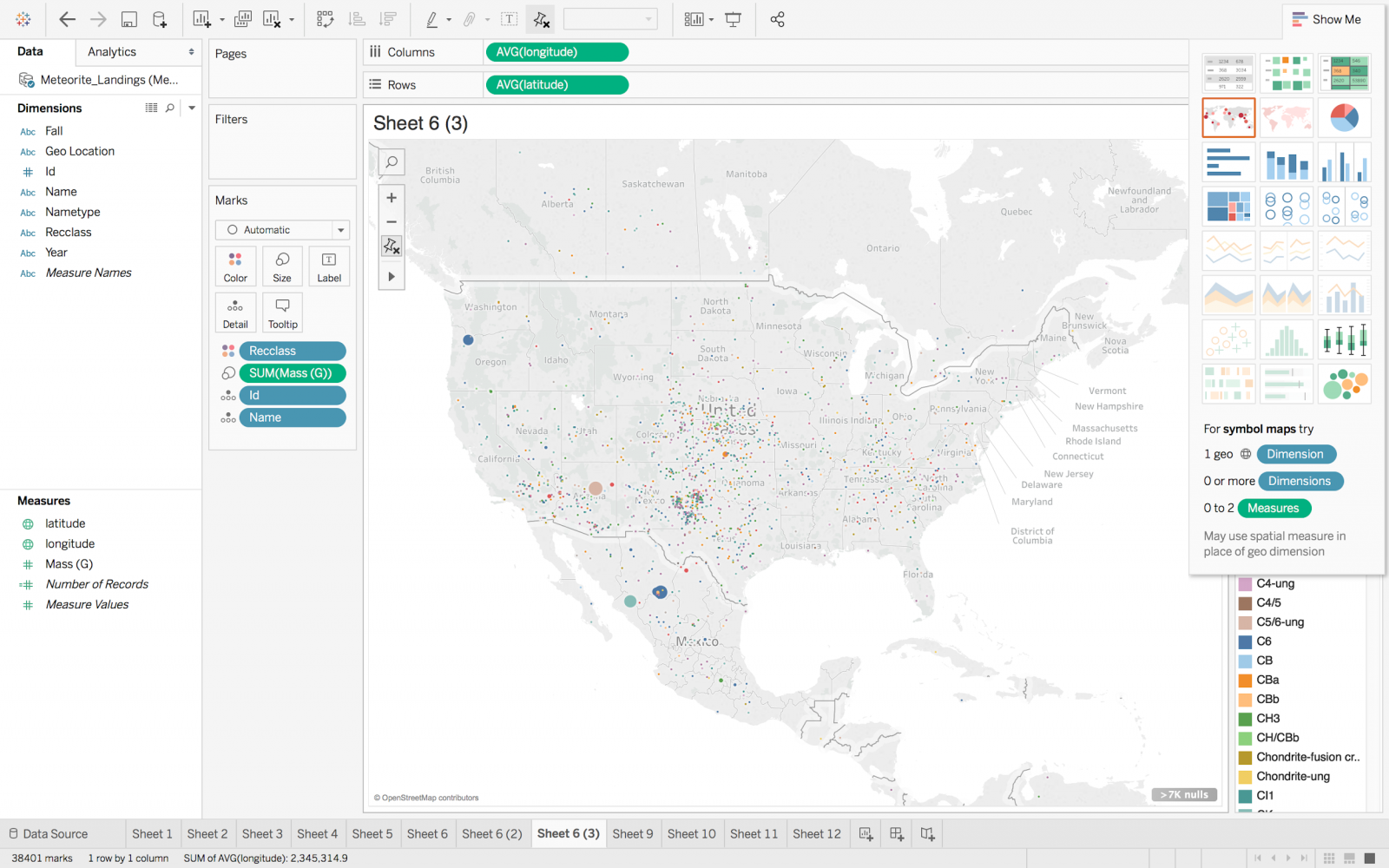
Tableau also allowed me to look at the ranges of values for different fields, such as the earliest record, latest record, total mass, largest mass, and smallest mass, among other possibilities.
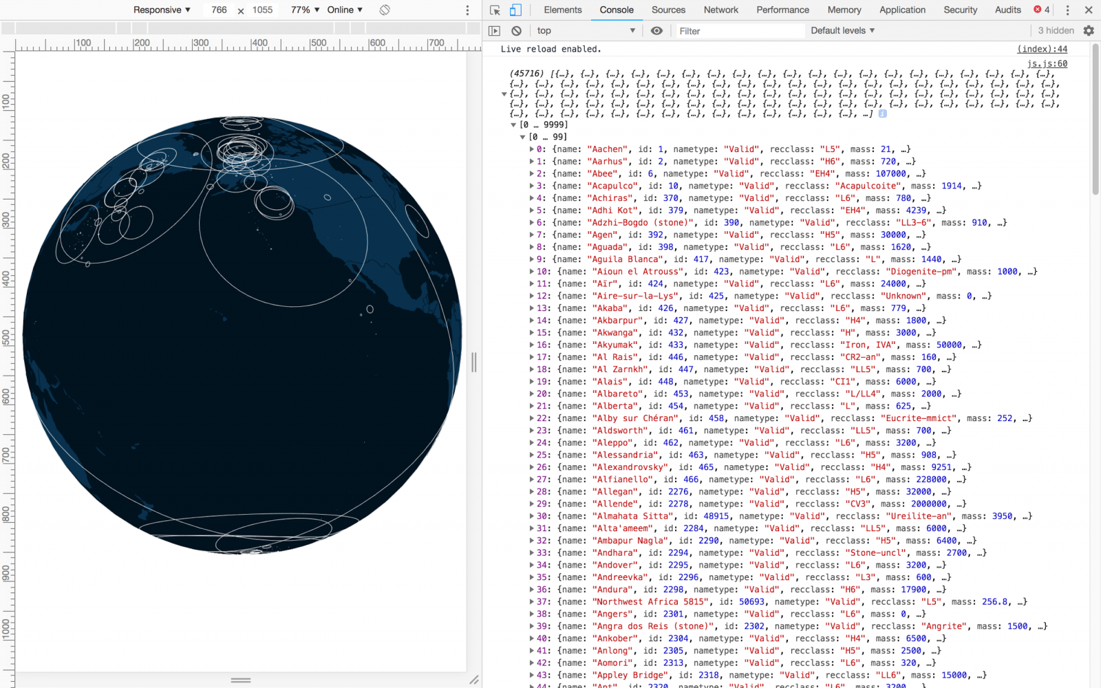
Showing data points as dots on the map are tricky with this dataset. Small points get lost among the larger ones, and there are over 40,000 data points, which could easily overwhelm a web browser. Some cells in the table have invalid values (such as Null).
I began looking at methods to incorporate this into the web browser. One solution was to use d3.js. The learning curve is quite steep, since there are many different options for creating unique visualizations. A tool I came across was planetary.js, which is based on d3.js. It creates a plugin-based environment around a planet object, and allows users to create their own plugins. The built-in plugins are easy to set up, and allow for quickly setting up the rotation and zooming features I was interested in. I started out with the static globe example, and looked at the “2013 Seismic Activity Visualization” example, adapting some elements into my final visualization.
The example can be found here:
http://planetaryjs.com/examples/quake.html
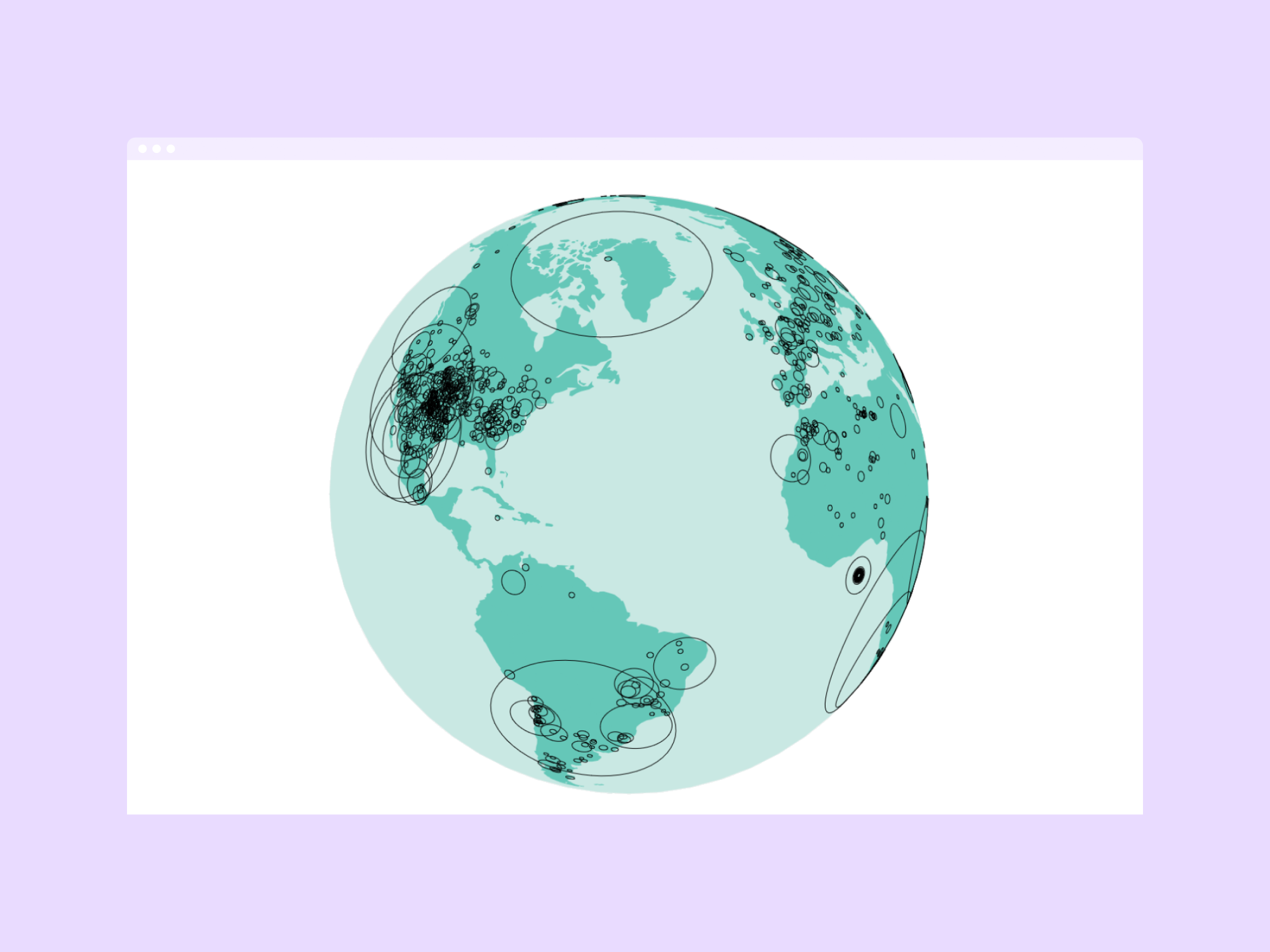
The built-in “ping” plugin is used in the example to display a ping and fade it out. Some data points in my Tableau prototype were getting lost behind others due to being displayed a solid circle. The solution is to display them as outlines, since many meteorite landing coordinates are packed tightly together.
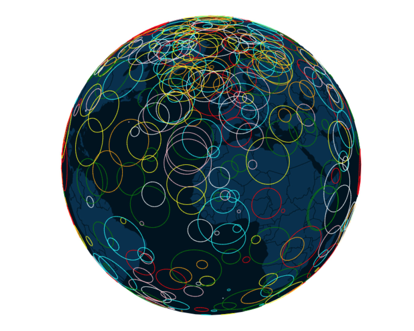
Creating a custom ‘outline’ plugin to display randomized data points,
based on the built in ‘ping’ plugin and the Seismic Activity example.
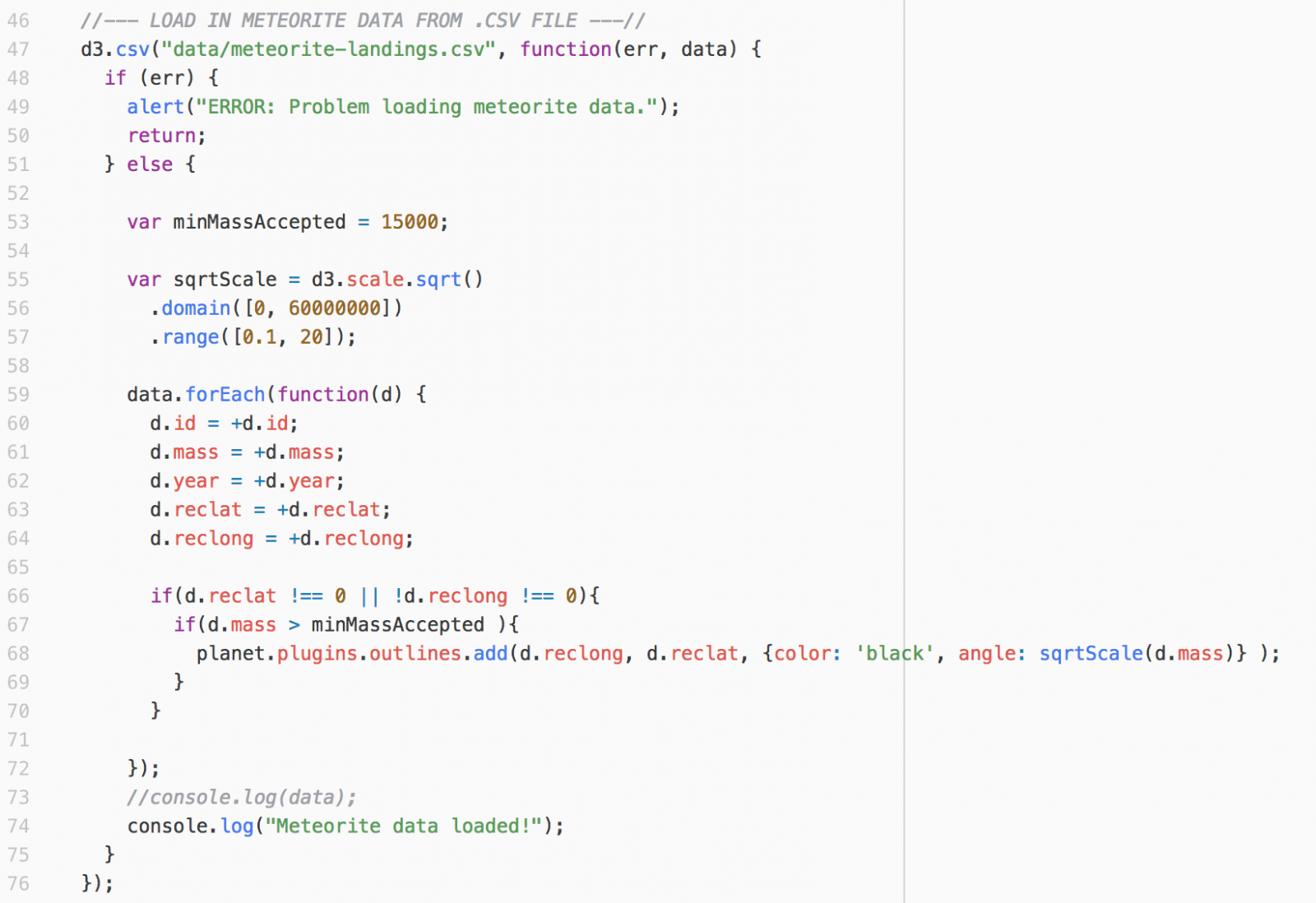
I adapted the “ping” plugin into my custom planetary.js plugin, planetaryjs-outlines.js. It works very similarly to the “ping” plugin. I was surprised that planetary.js did not offer a feature to easily display static data points, instead of having them fade out. There is a custom TopoJSON plugin to show continents, borders, and lakes. It takes a JSON file containing this information and stores it in a layer. Then, data points are drawn on top. I used the world-100m.json file provided on the planetary.js website, which was converted from the types available on http://naturalearthdata.org.
After testing my custom plugin with randomly-generated data points, I wanted to check how many meteorite data points the browser was able to handle. I used d3.csv to parse in the .CSV file data from NASA. One great source I found was http://learnjsdata.com/read_data.html
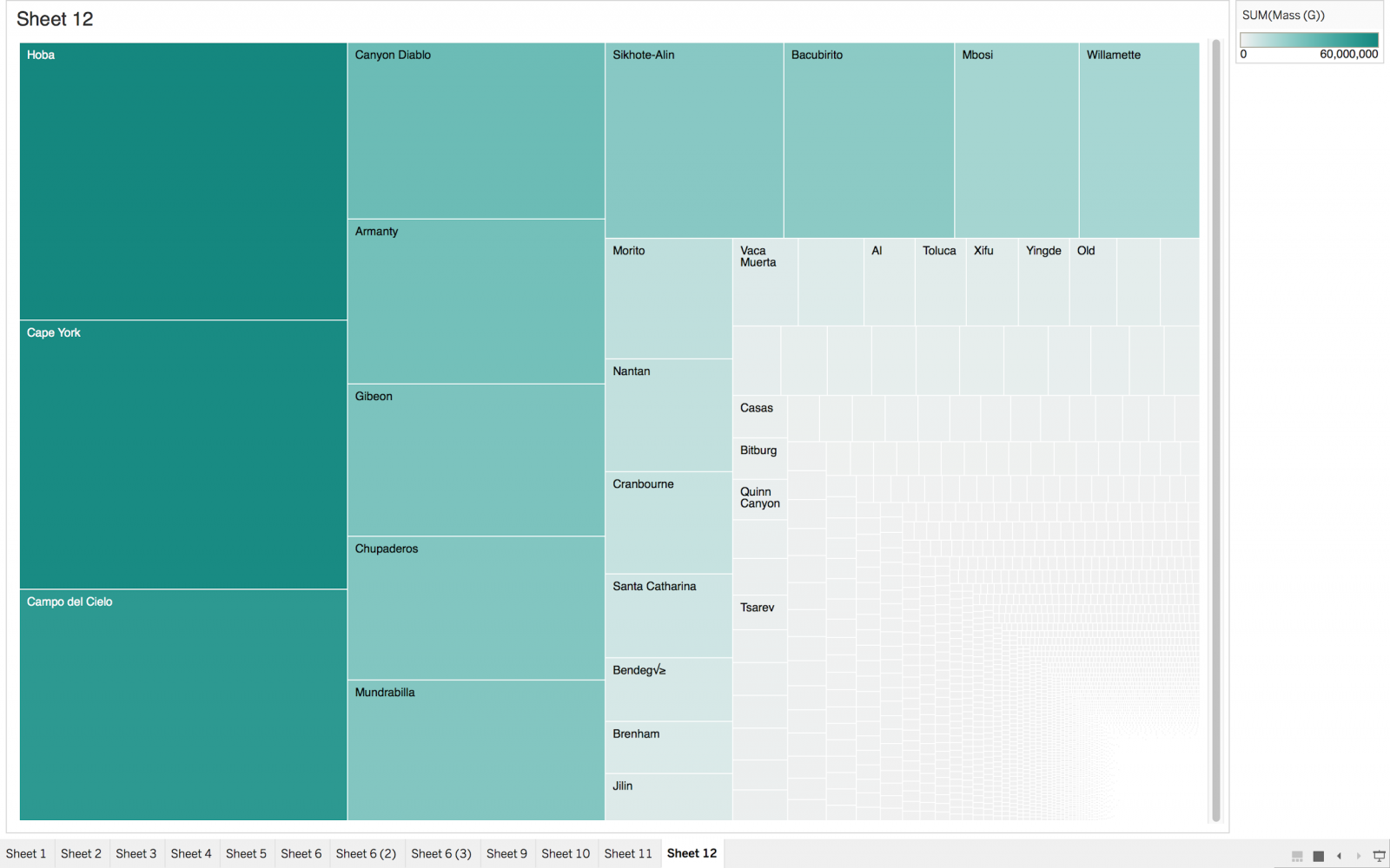
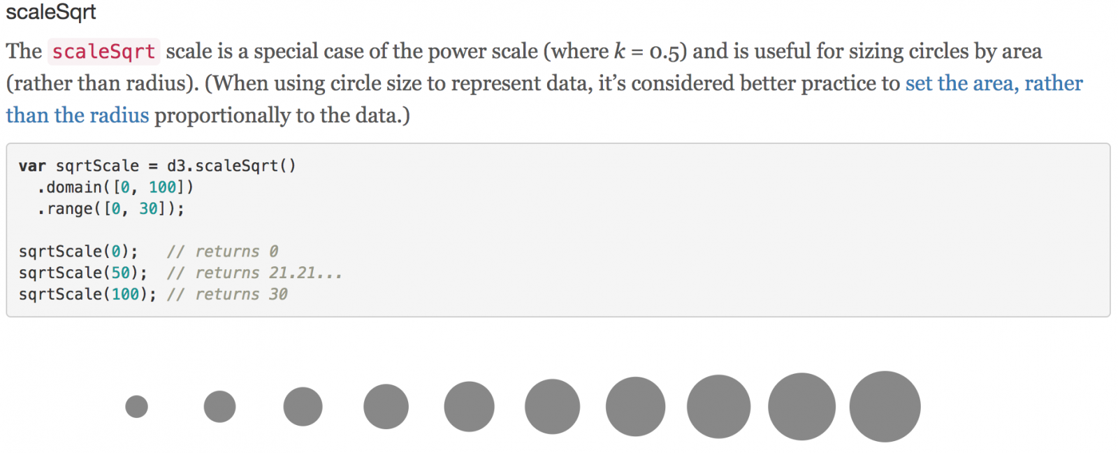
It was crucial to make the mass of each meteorite the area of the corresponding circle, instead of the radius or diameter for an accurate representation.
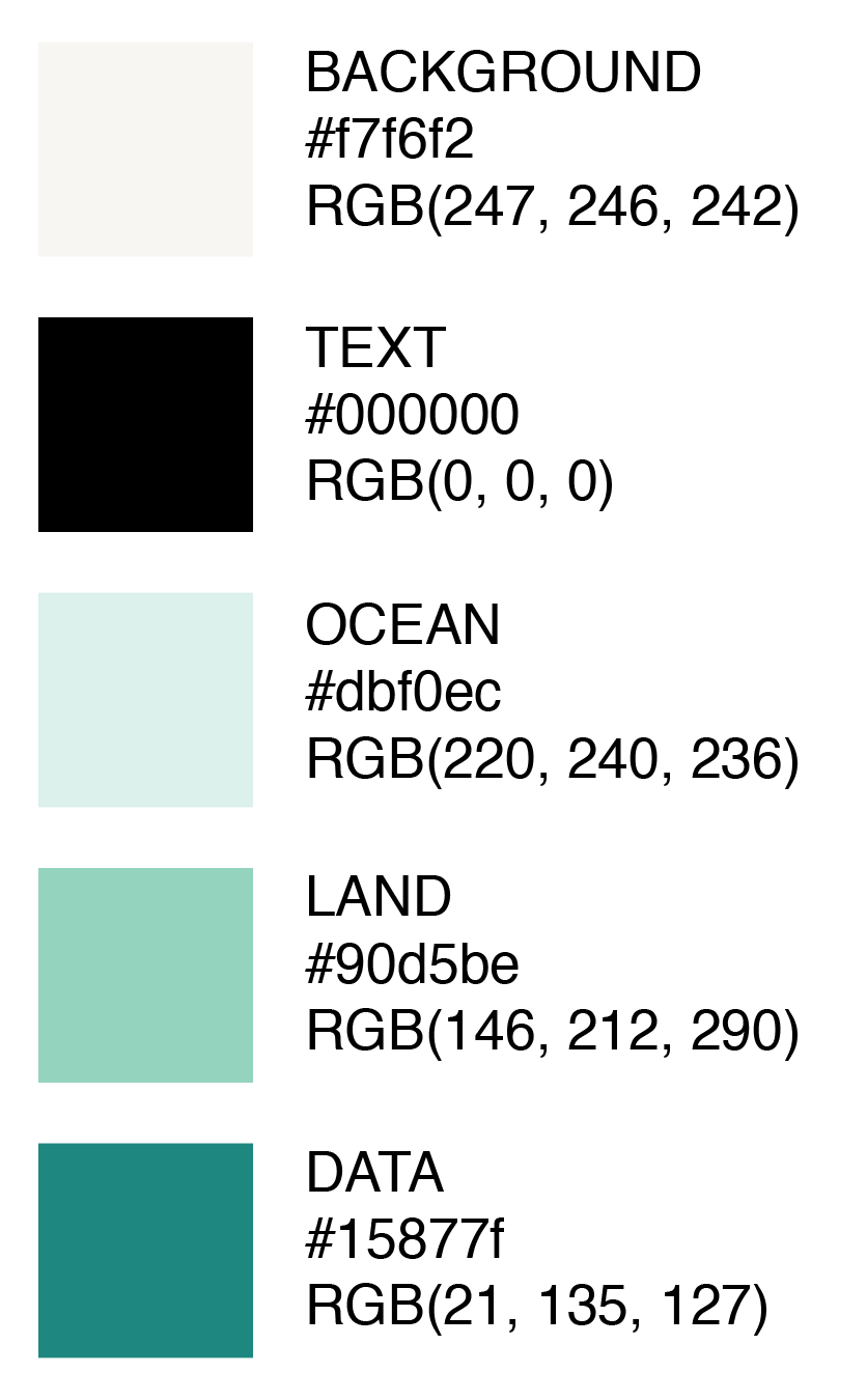
Colours were selected and represented using hex codes inside planetary.js plugin parameters, and in the CSS stylesheet.
Some ways I would like to expand on this project in the future:
- “Bake” small data points into an SVG to render on top of the planet object, instead of rendering each item in an array of 40,000.
- Provide tooltips to larger meteorite data points.
- Entire page built with interactive d3.js visualizations.
- Real-time data updates
References:
Data source (NASA .CSV file):
https://data.nasa.gov/Space-Science/Meteorite-Landings/gh4g-9sfh
World map outlines:
http://planetaryjs.com/download/
https://github.com/topojson/world-atlas
Using .CSV data files:
https://d3-wiki.readthedocs.io/zh_CN/master/CSV/
Adding outline data points:
https://d3indepth.com/scales/
http://mappable.info/blog/2015/5/16/a-spinning-globe-in-d3/