My Roles
UI Design, Front End Development
Tools I Used
Figma, Adobe Illustrator, Unity, XAML (WPF), Git
Overview
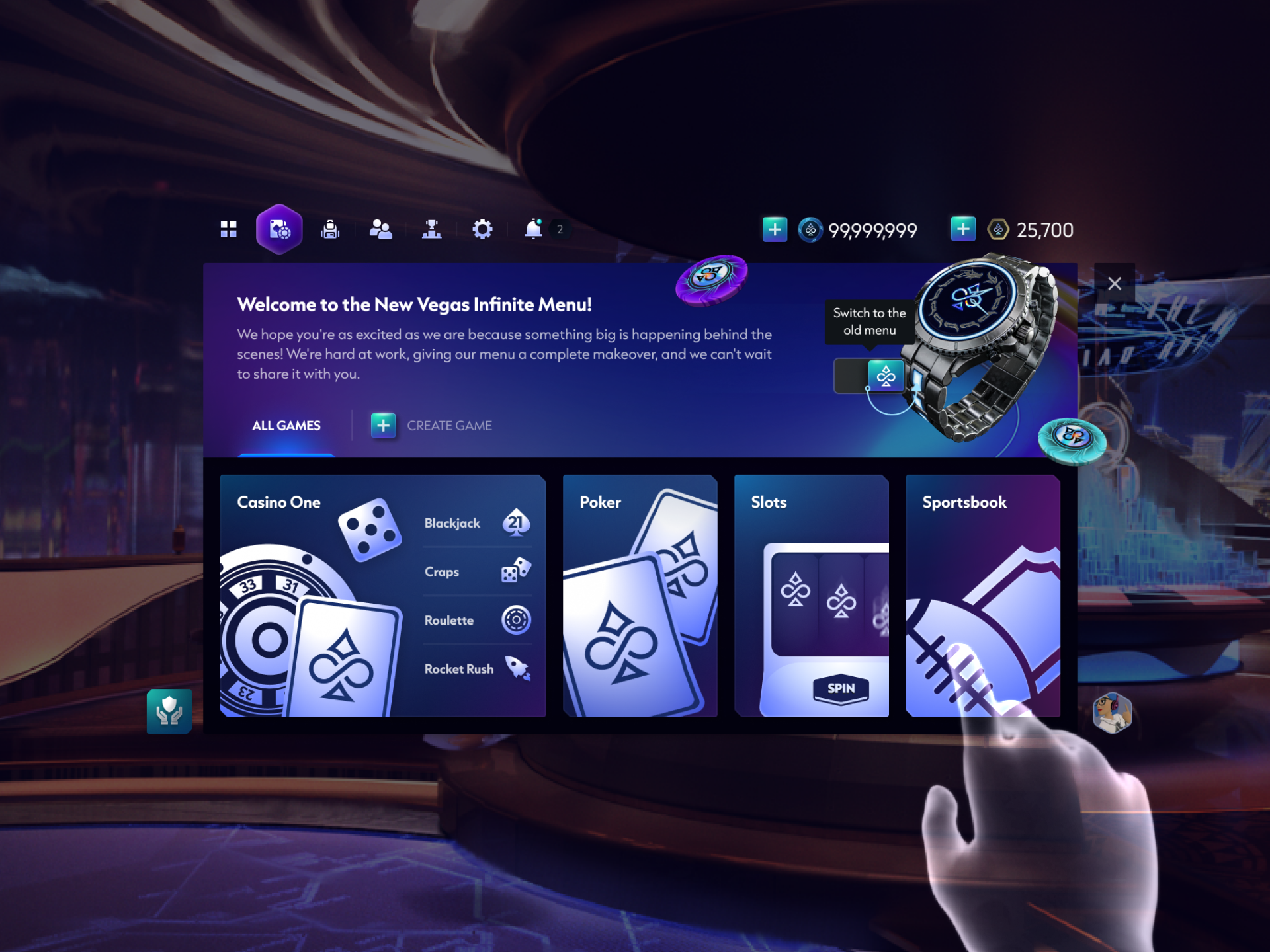
I worked on revamping the the watch interface, the primary UI used between games and features. This involved designing the new UI, and implementing it in Unity via XAML (WPF) and C# code.
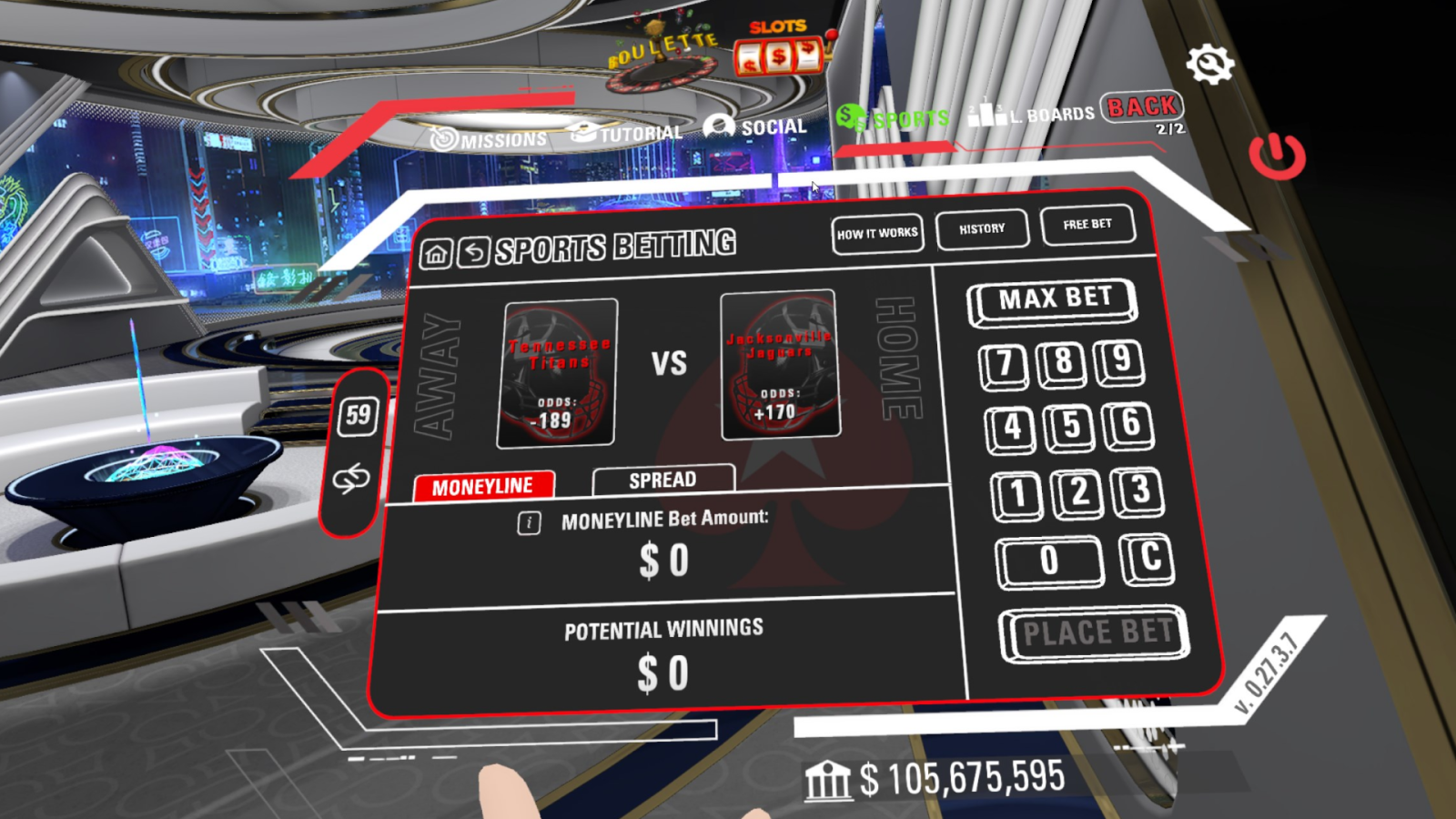
The UI needed to be revamped due to three primary concerns: a challenging UX for the player, an outdated visual design, and performance (especially in mobile VR). This coincided with several significant changes in the overall game: a rapidly increasing number of game types and features, and a rebranding of the software with a significant overhaul to the visual identity.
Process
Documentation
I started with creating extensive documentation of the entire flow of the old UI, which consists of screenshots of the UI within tables showing the main hierarchies. Since there was no previous documentation about any UI systems, this was a good place to start. I developed an editor tool in C# to make this process easier, as this tool allowed me to freeze the UI in frame and take screenshots. I later examined this to contribute to the design of the new UI.
This documentation later became widely used across the organization, and interestingly especially by the QA team as a stable point of reference. My editor tool made it significantly easier to keep the documentation up to date.
As a part of this process, I identified UI and UX issues to be addressed in the revamp in an itemized list. The master list was further expanded with a user study and interviews conducted by the research team.
Information Architecture
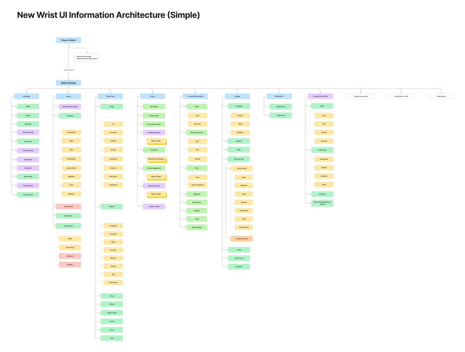
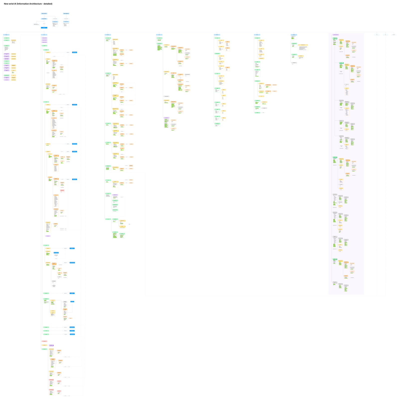
I mapped out the entire IA of the current UI. Since there was a vast amount of information to capture, I created two versions: a simplified and full version. The simple version acted as an overview, while the full version captured every single piece of information available and action that the user could take at any point.
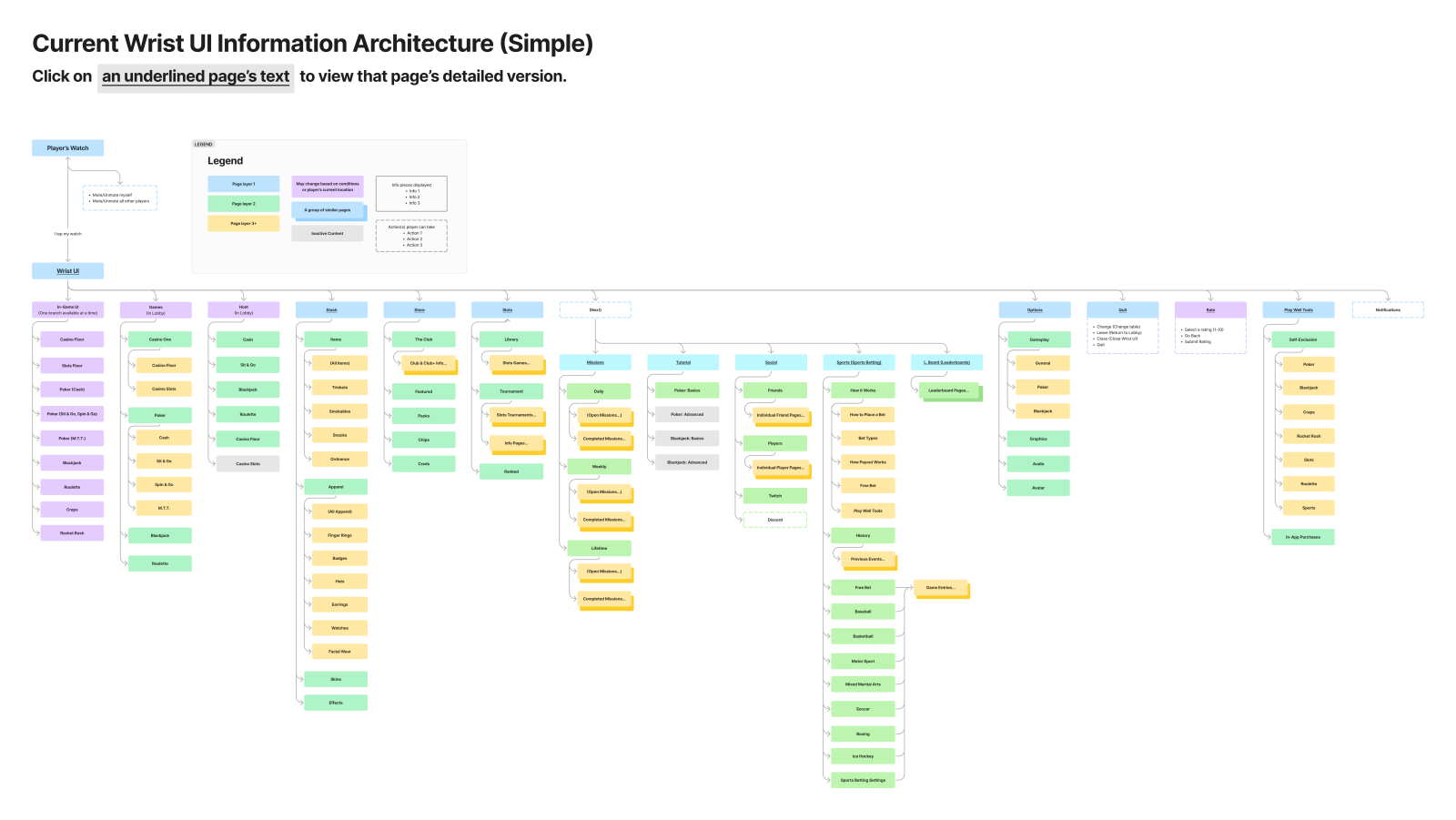
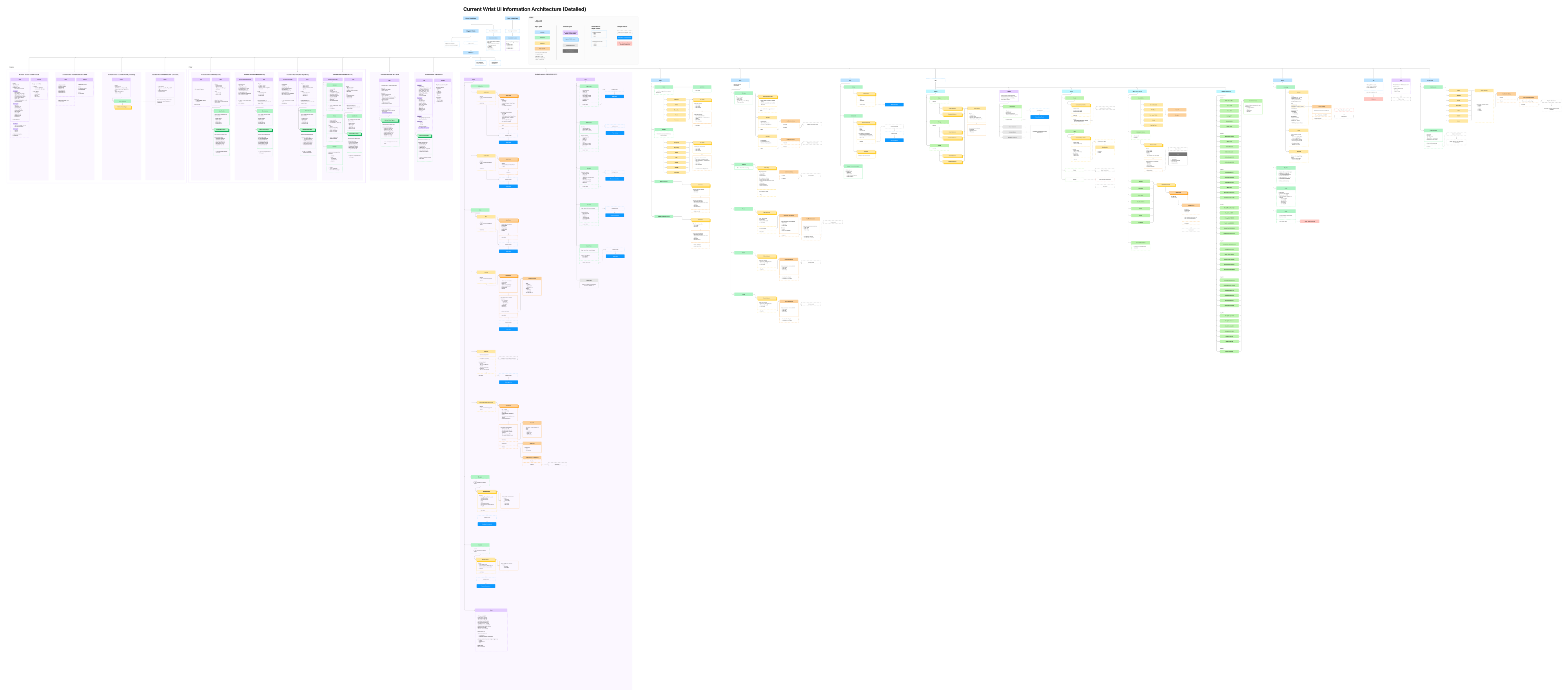
Old architecture
Revamped architecture
After mapping out the old IA, I collaborated with my team to create the new revamped architecture. Having two versions, simple and advanced allowed me to compare the architecture from both high-level and detailed-oriented perspectives.
From identifying the main UX issues, we reorganized the architecture following some main considerations:
- There was no homepage. Poker acted as the first page.
- Users frequently missed all tabs after the “Next” button.
- There was little room to expand the UI for greater coverage of game features. For example, there was no dedicated notification list.
- Access to various games were scattered across the UI (Sports and Slots in their own separate menus, Craps and Rocket Rush nowhere to be found).
- Inconsistent layouts between game modes.
Wireframing & Low-Fidelity Prototyping
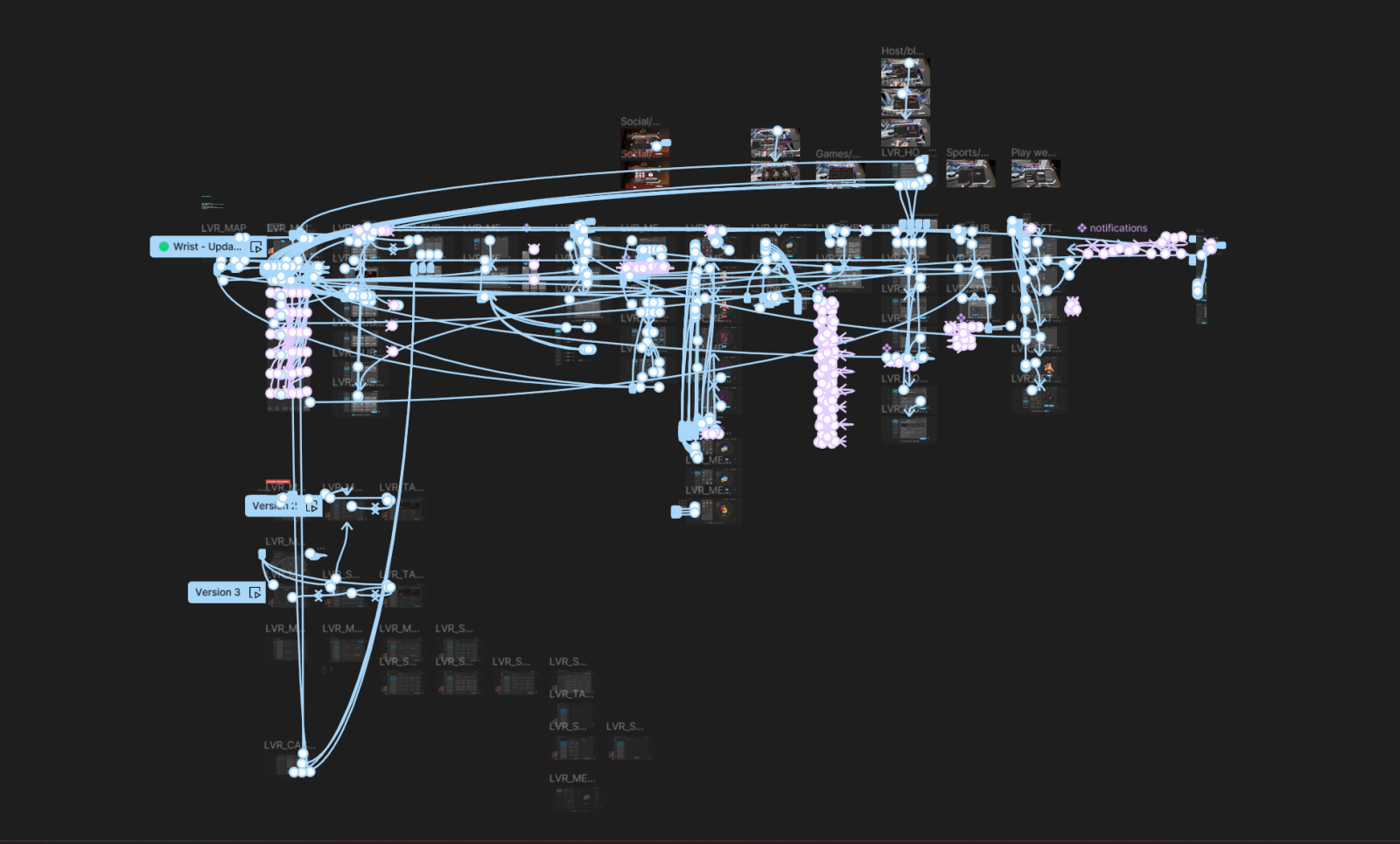
Using our findings, I worked on wireframes and low-fidelity prototypes to illustrate initial UX concepts.
Initially, this focused on the primary flows that exist outside of being in games themselves: finding, joining, and hosting games, the stash, store, friends, leaderboards and settings.
Once the designs were developed further, the process for the in-game UI began.
Further iterations of the UI. During this time, the rebranding to Vegas Infinite began. This rebranding would inform the appearance of all new UI. For now, we continued to develop the UI designs with placeholder fonts, colours, and images.
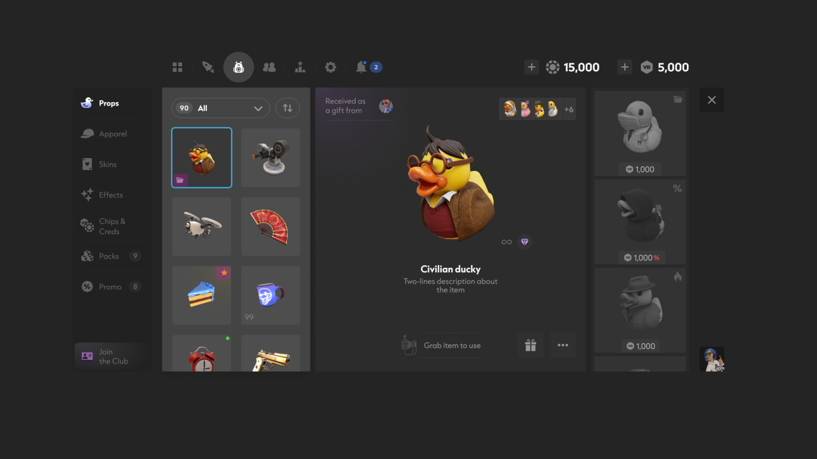
Final Designs
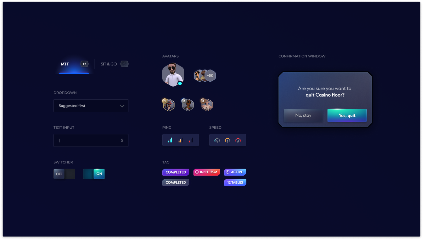
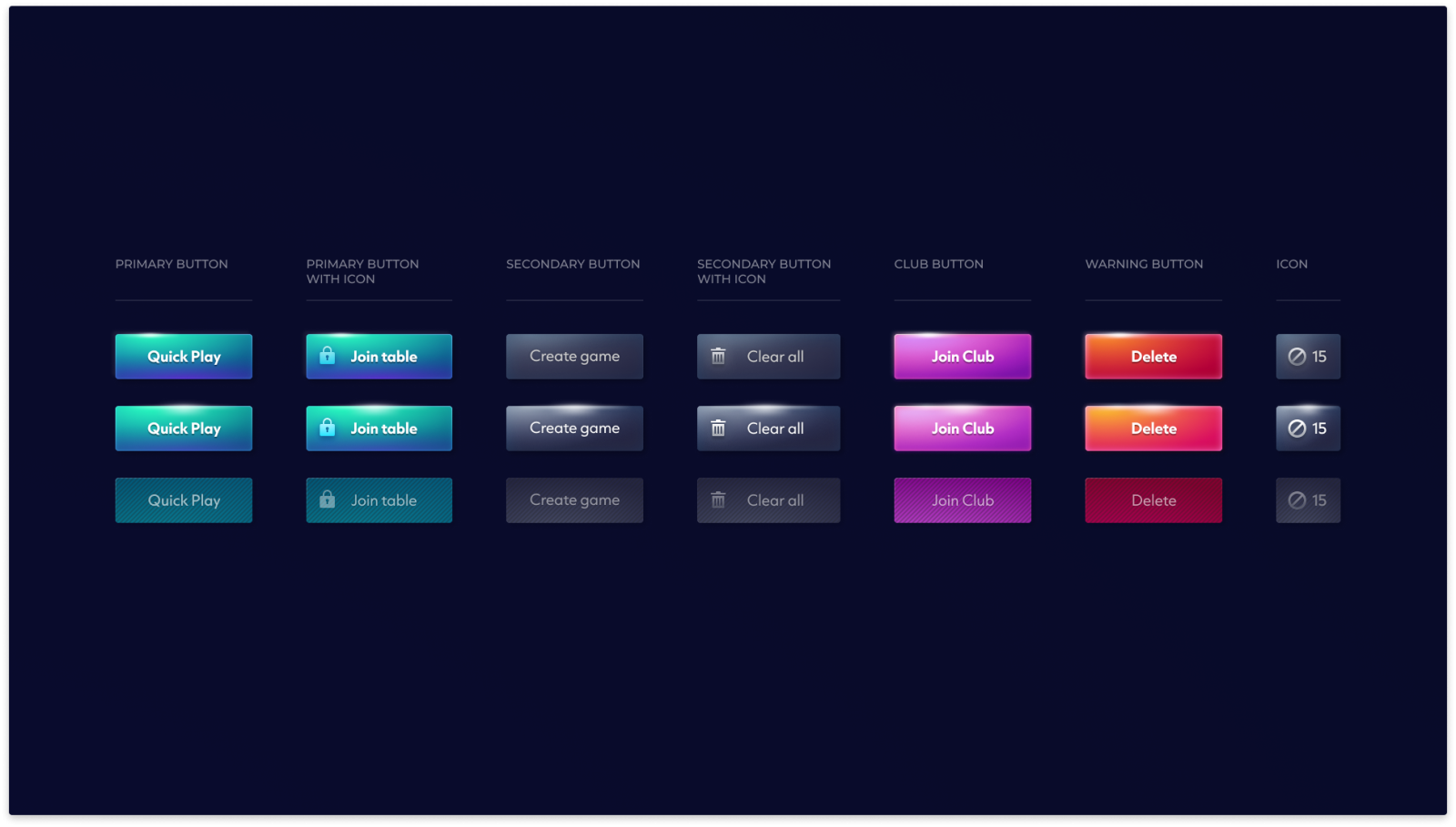
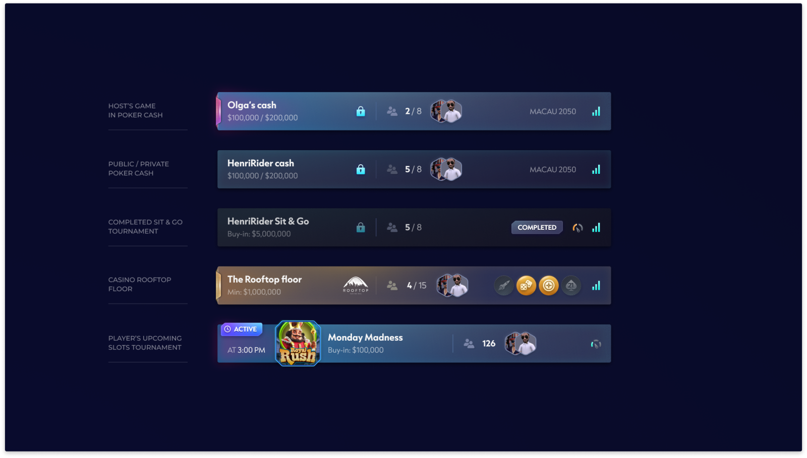
UI Components
Some of the main reusable UI components in the design system.
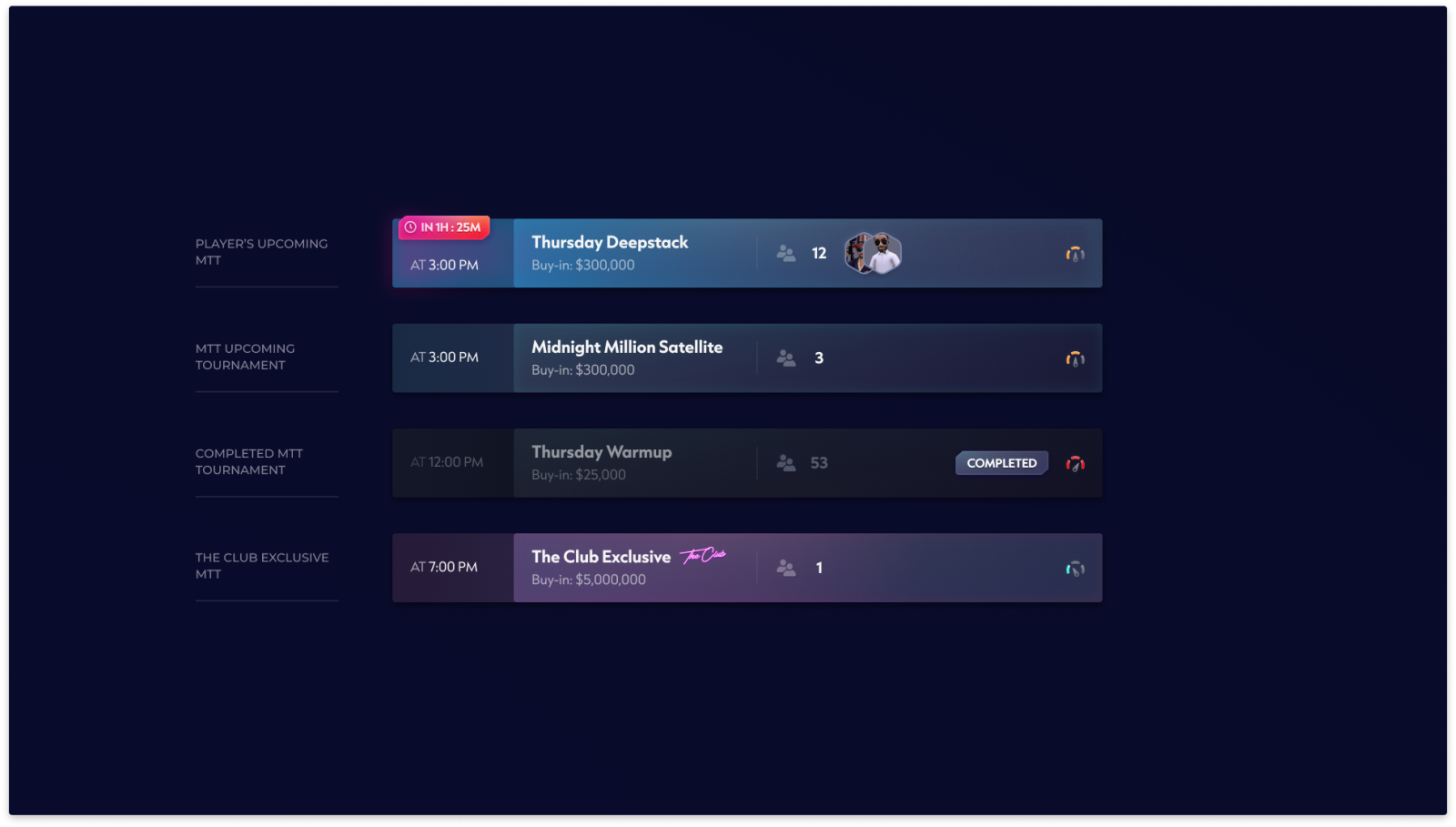
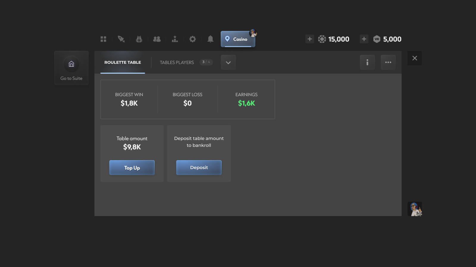
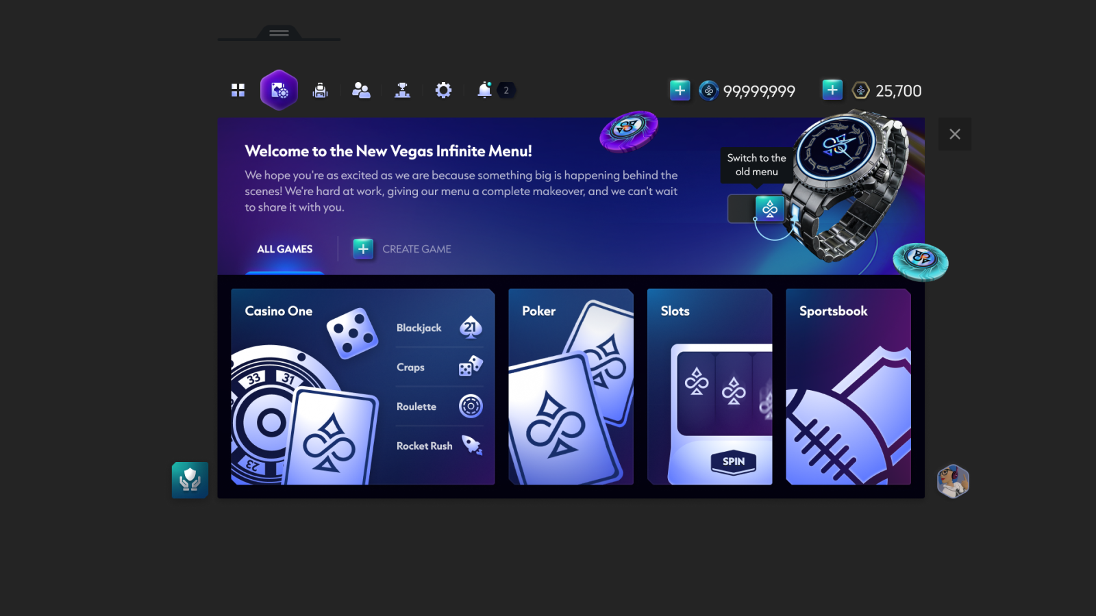
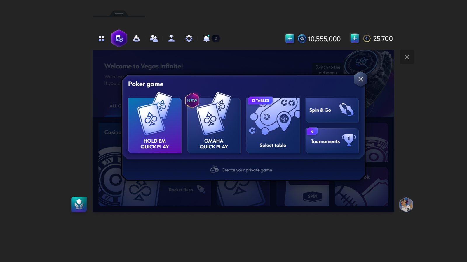
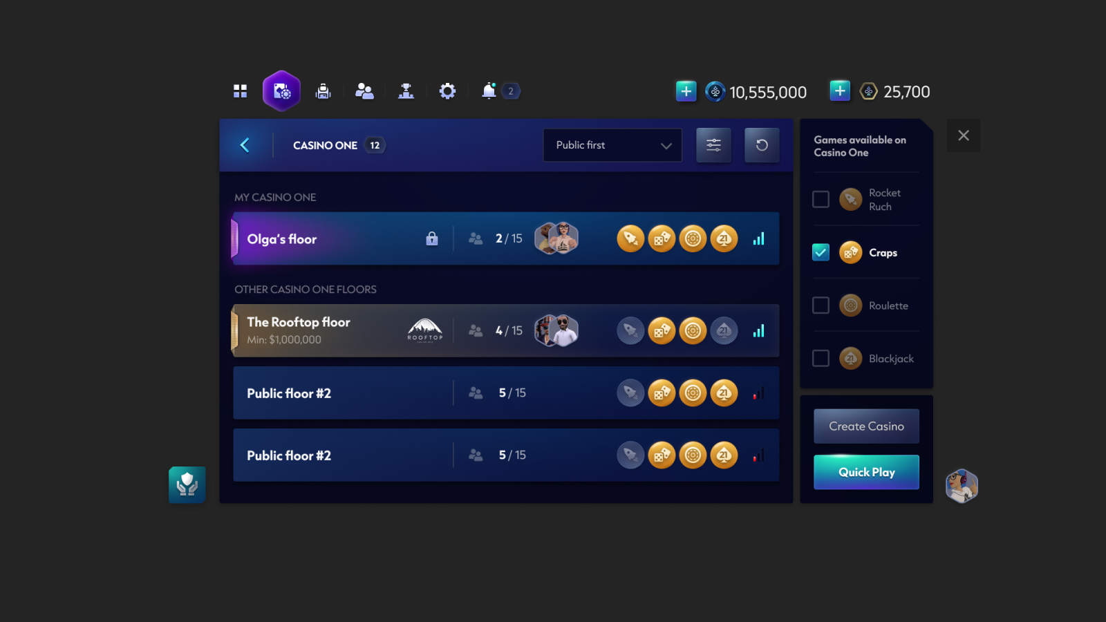
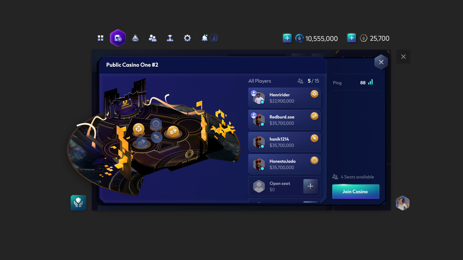
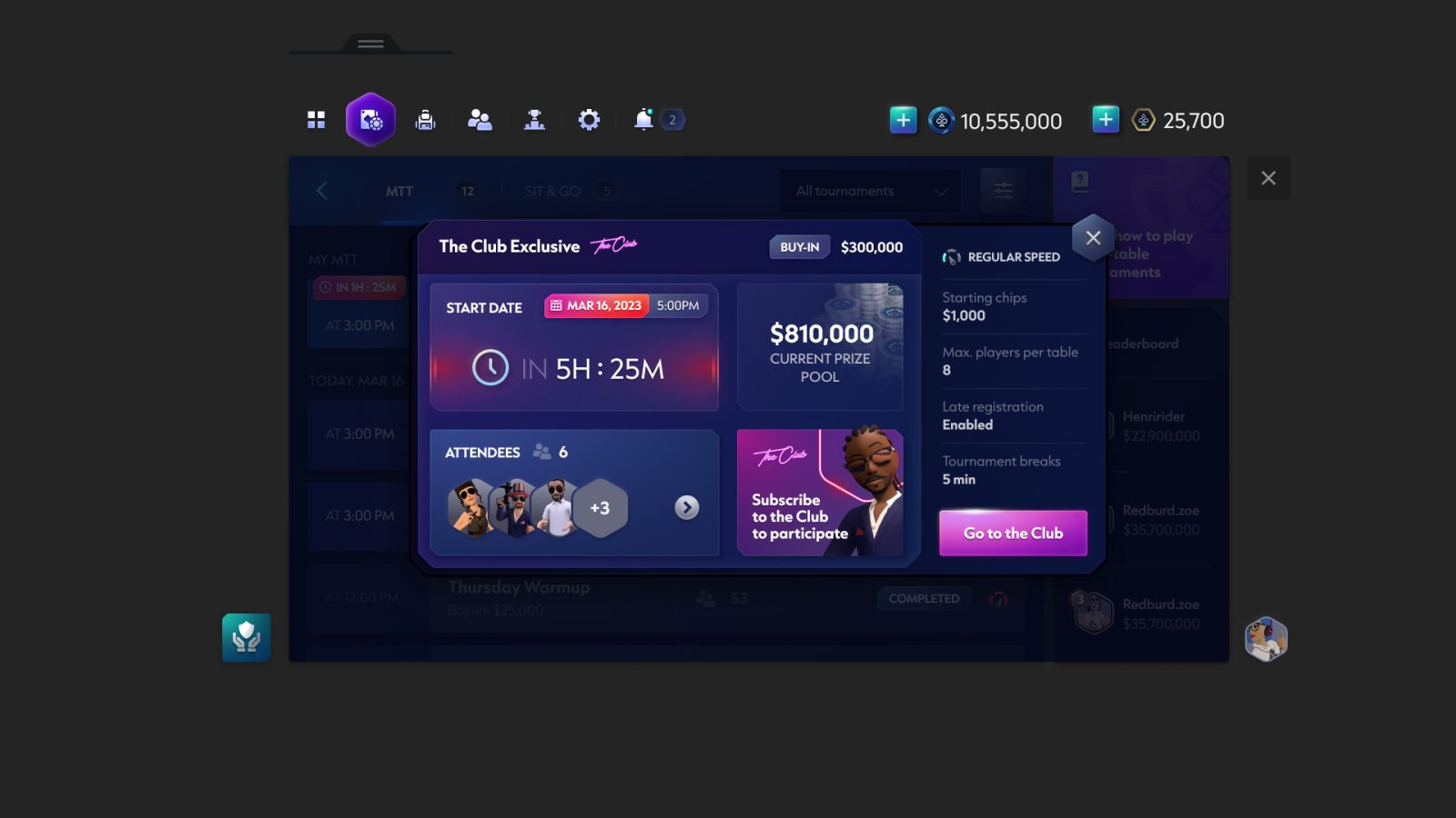
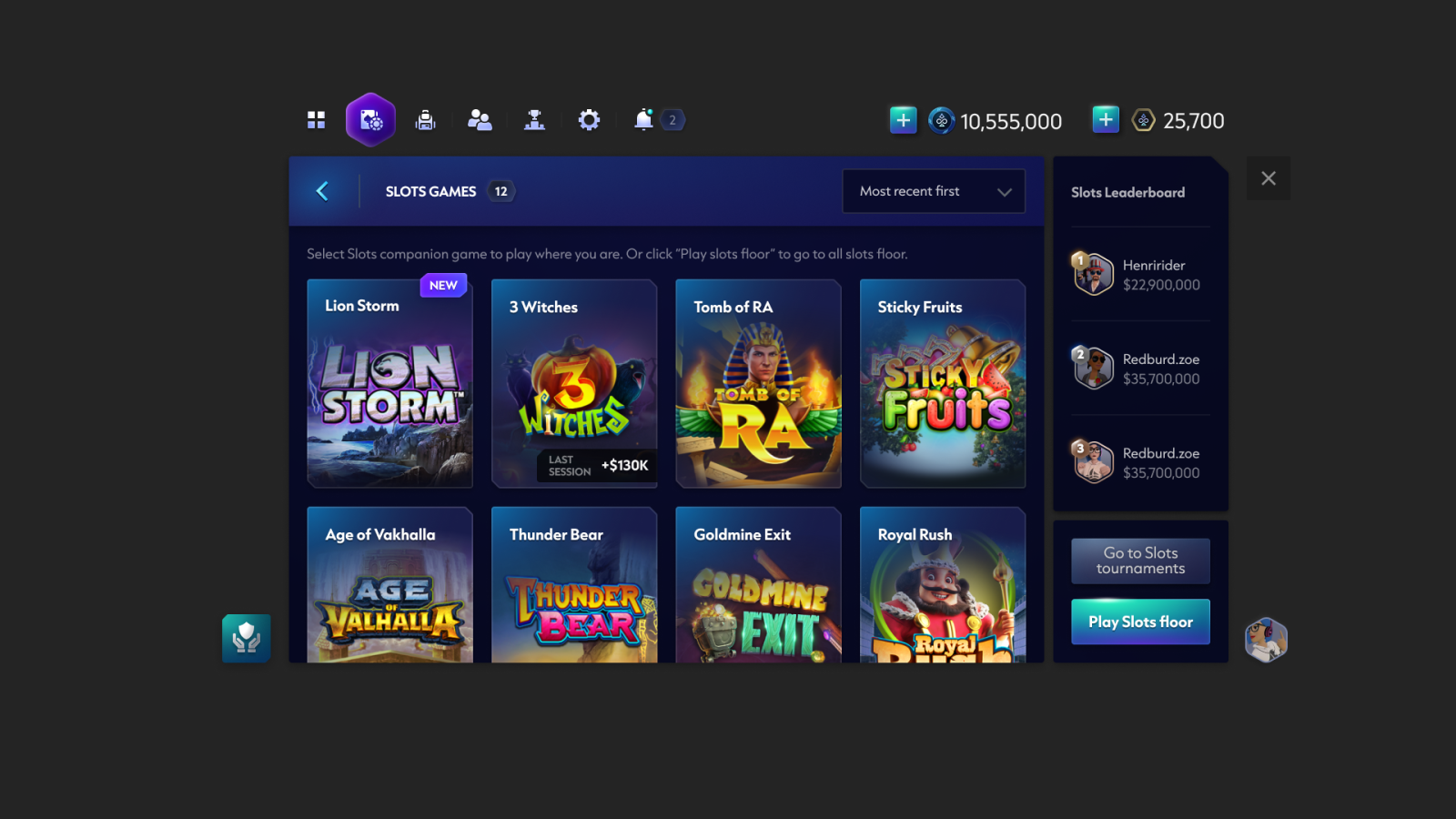
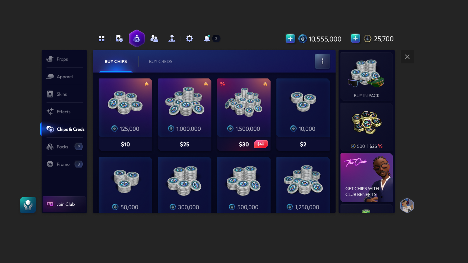
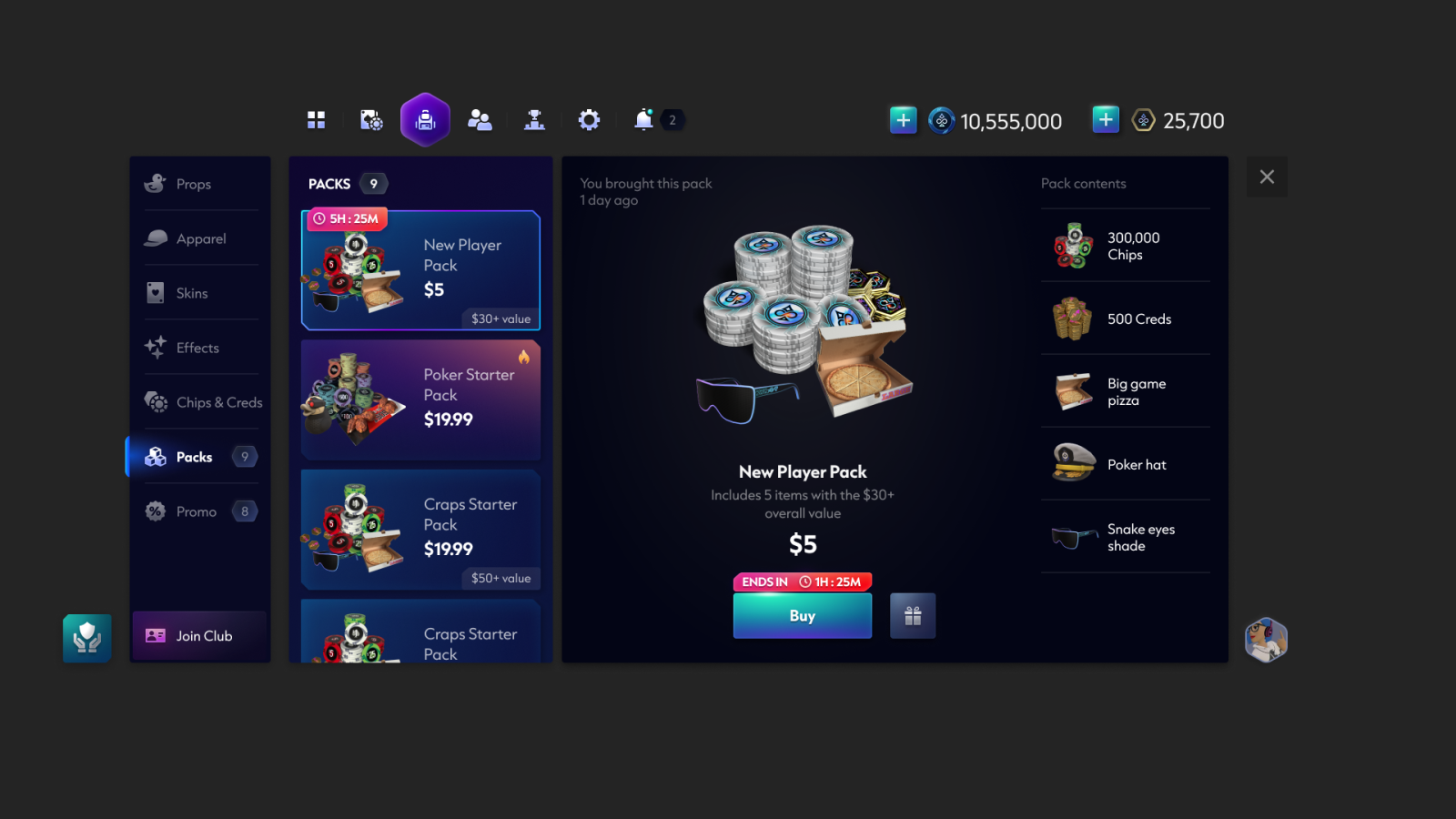
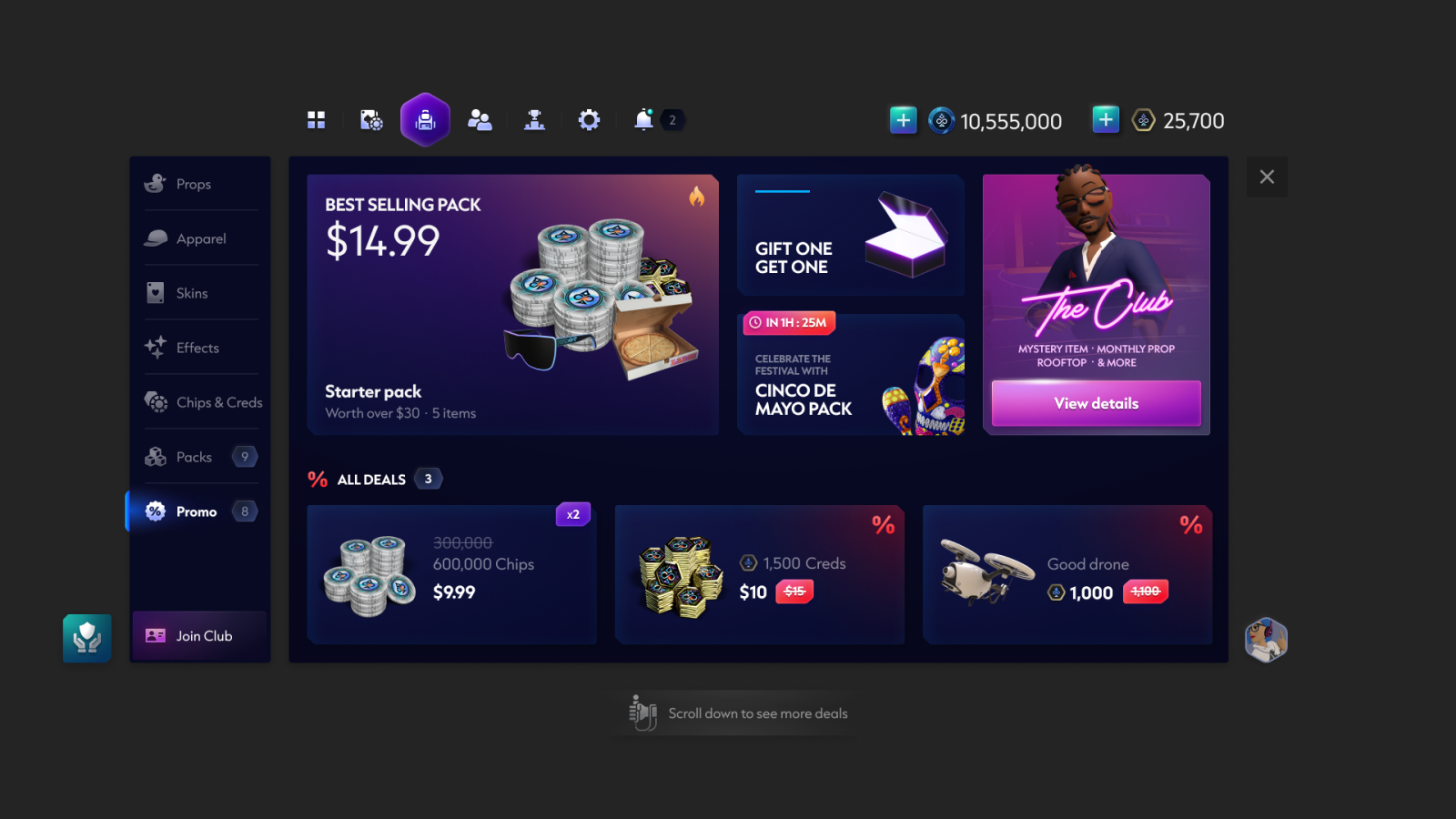
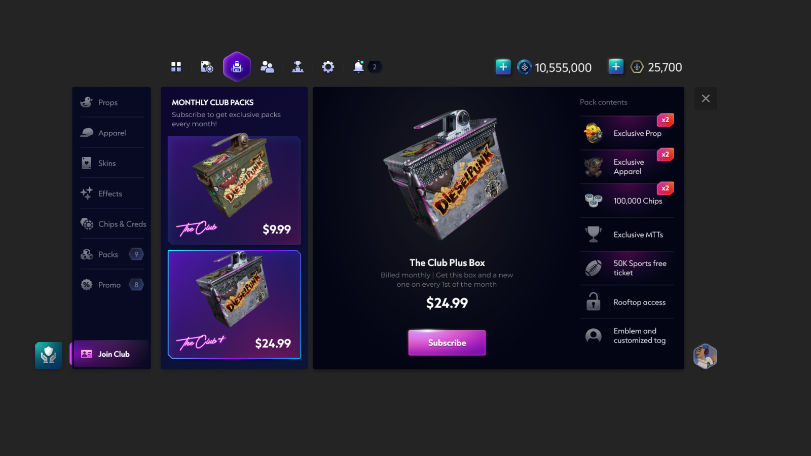
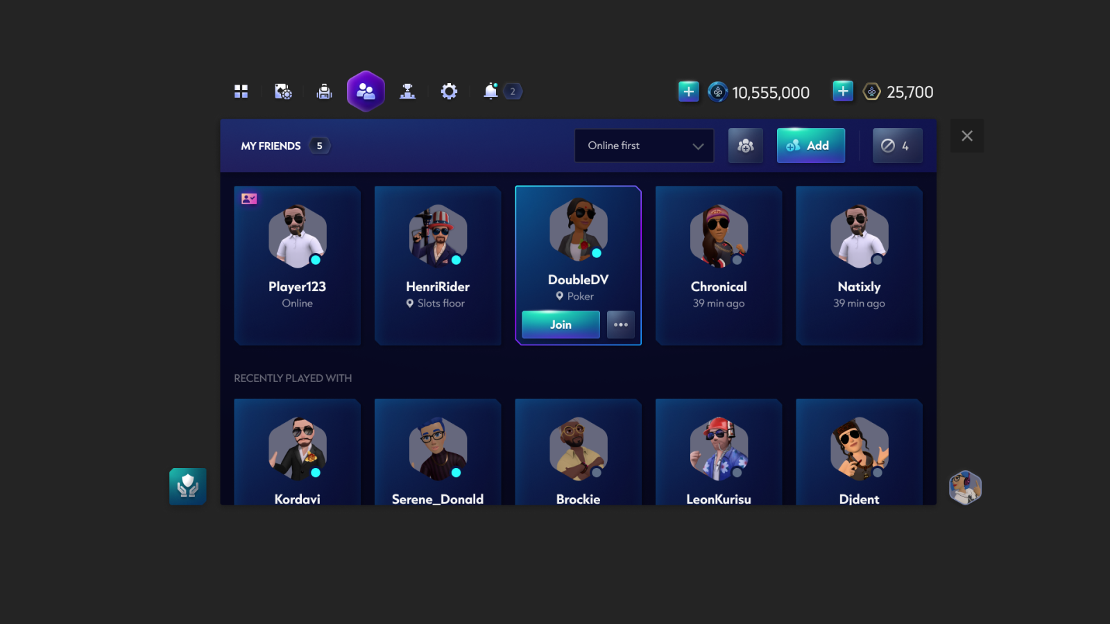
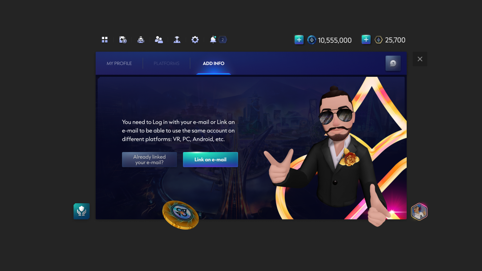
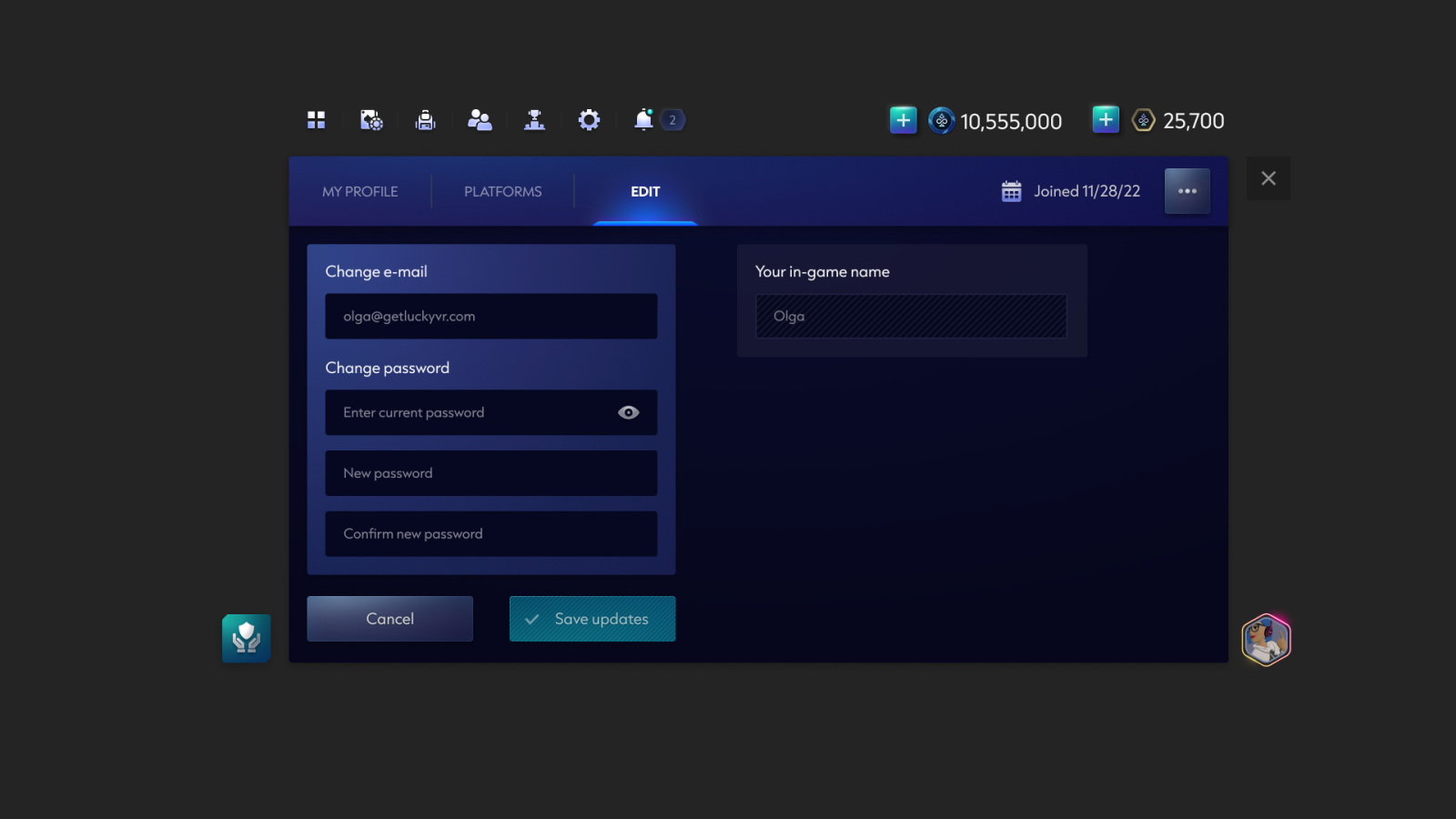
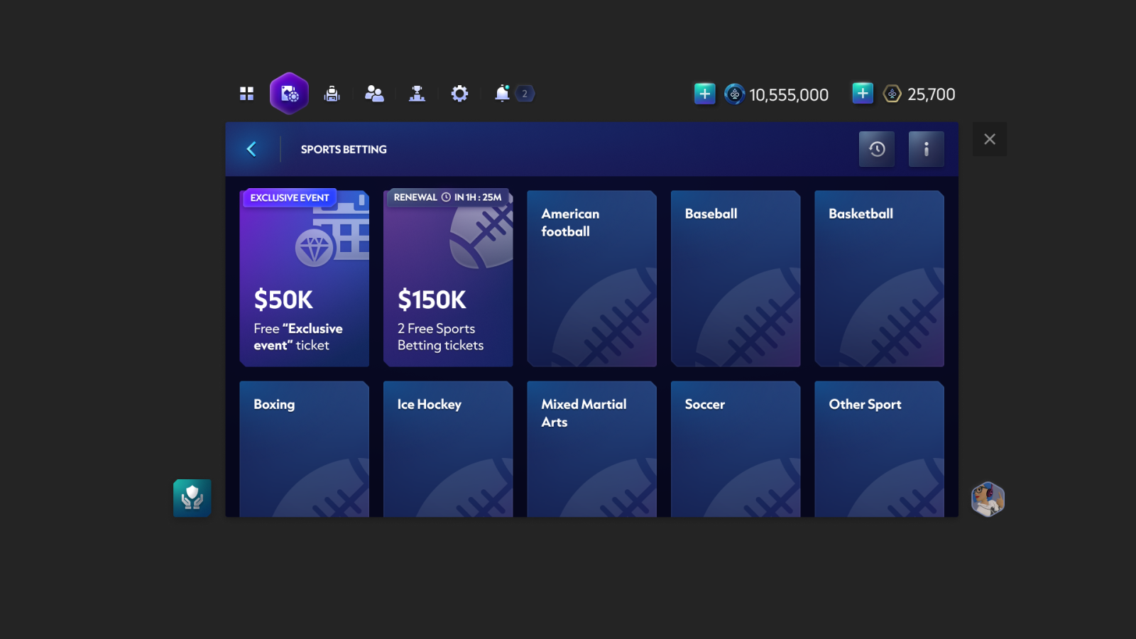
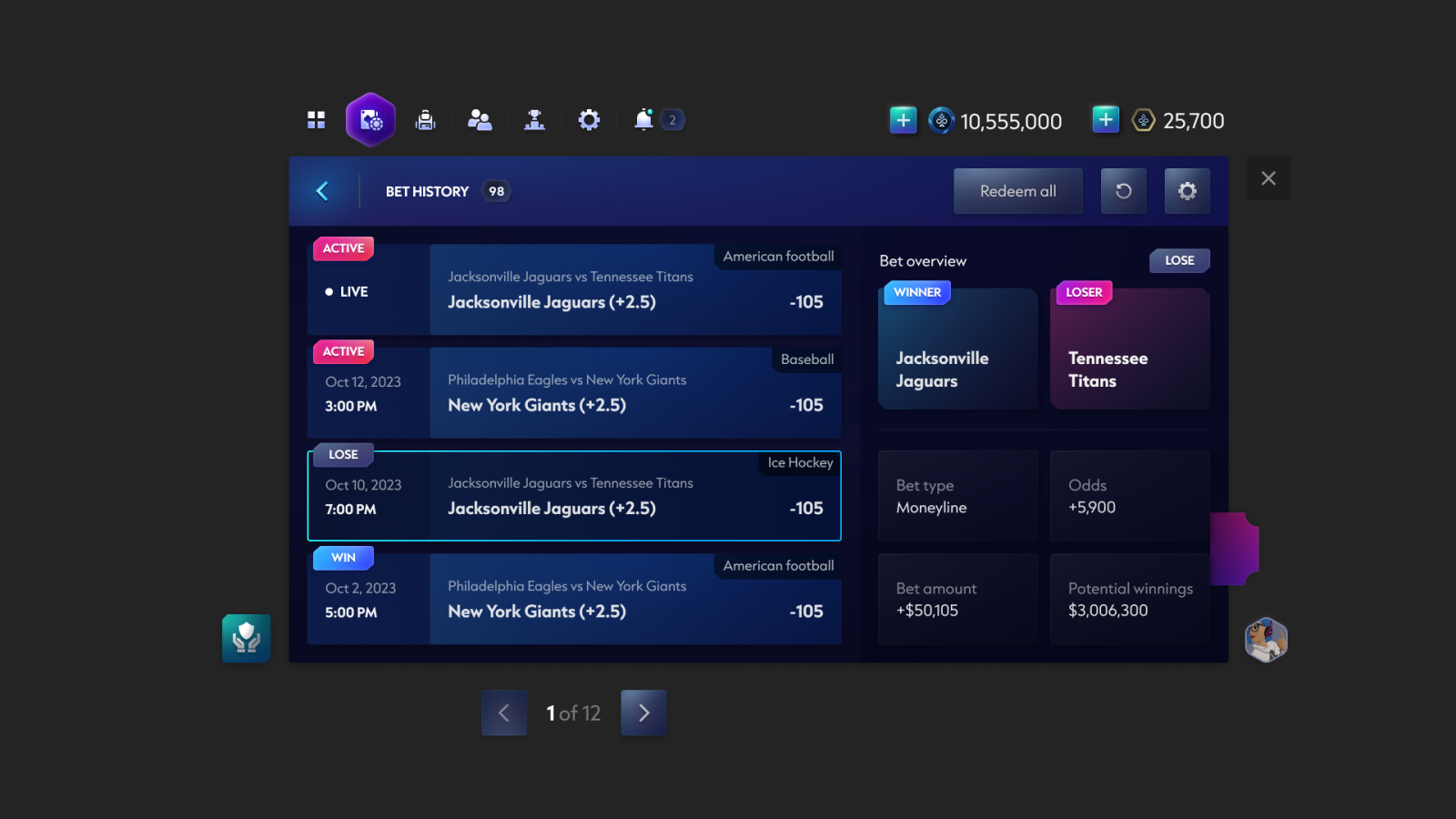
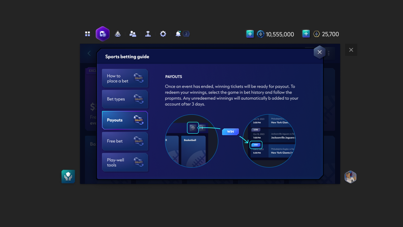
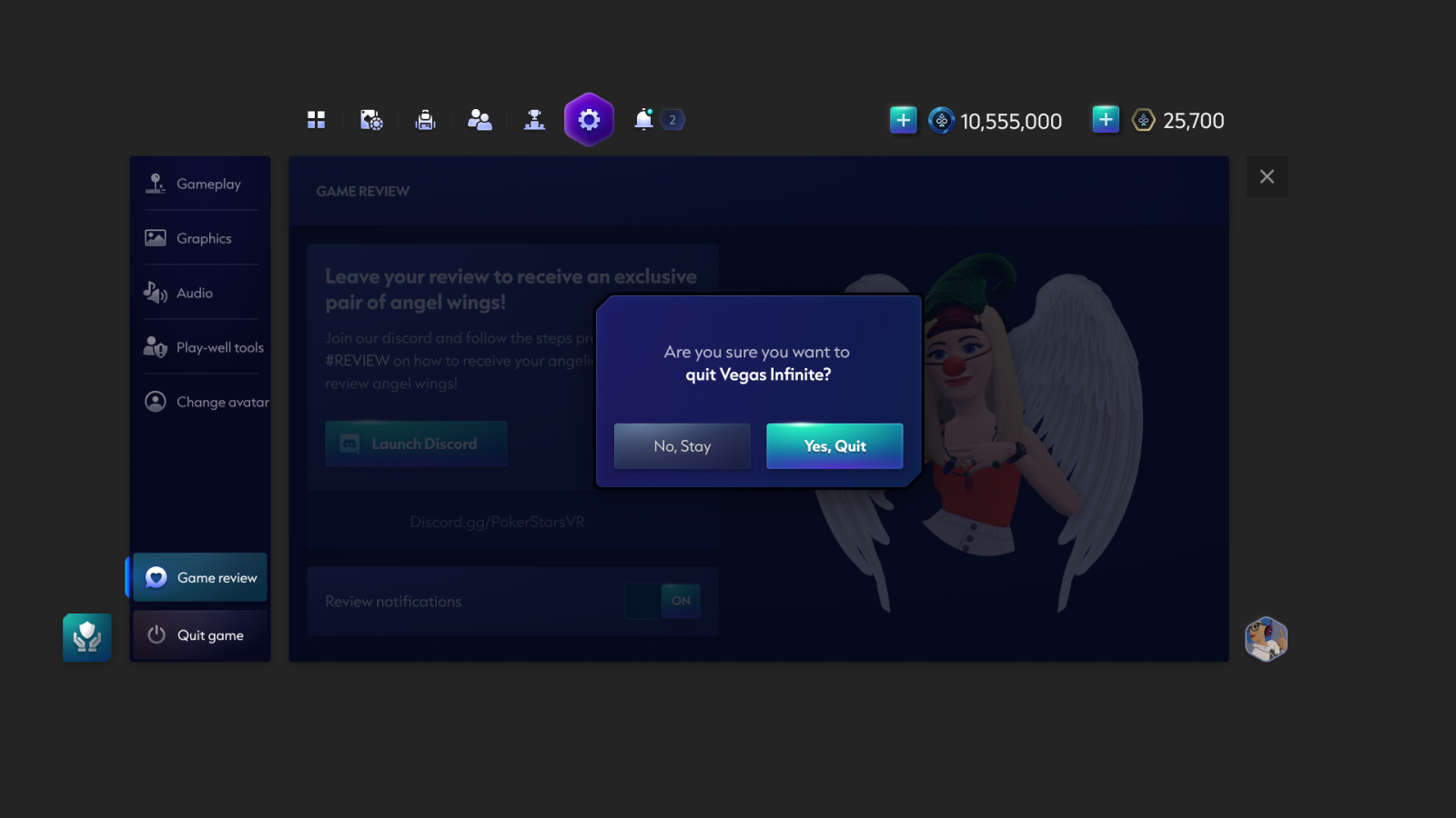
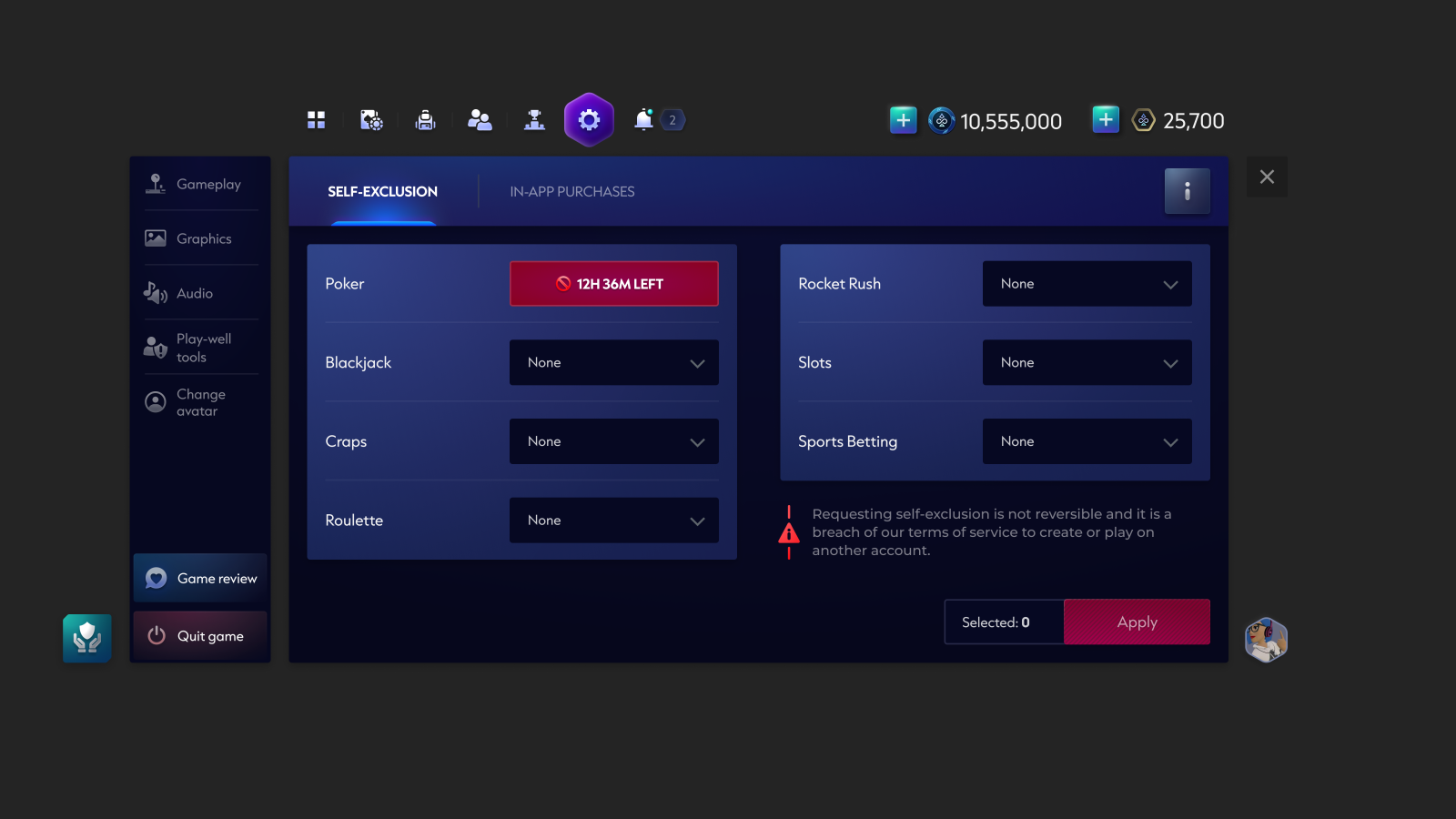
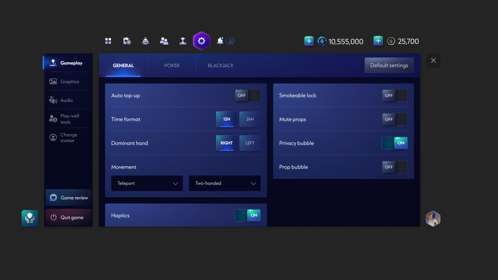
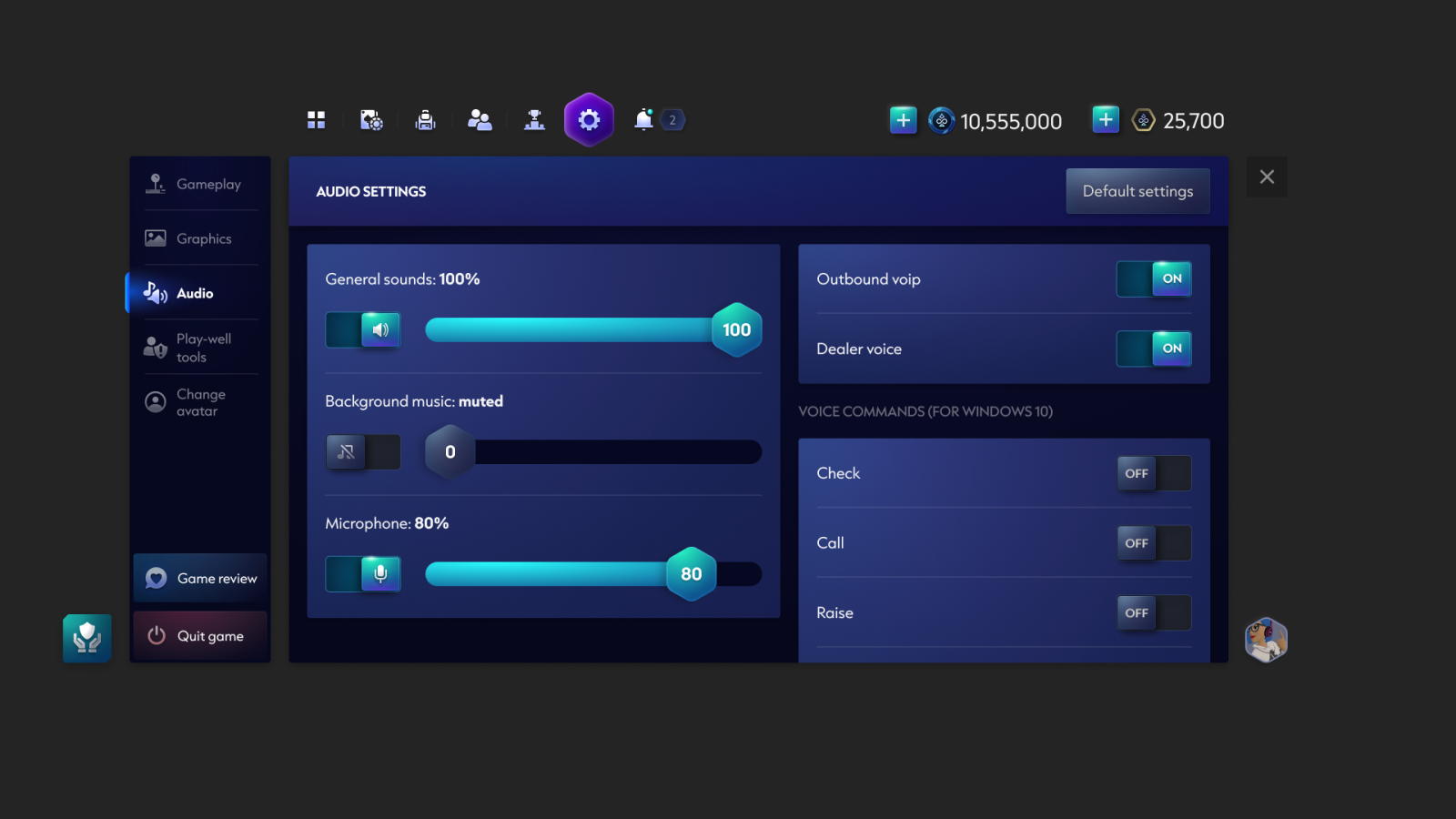
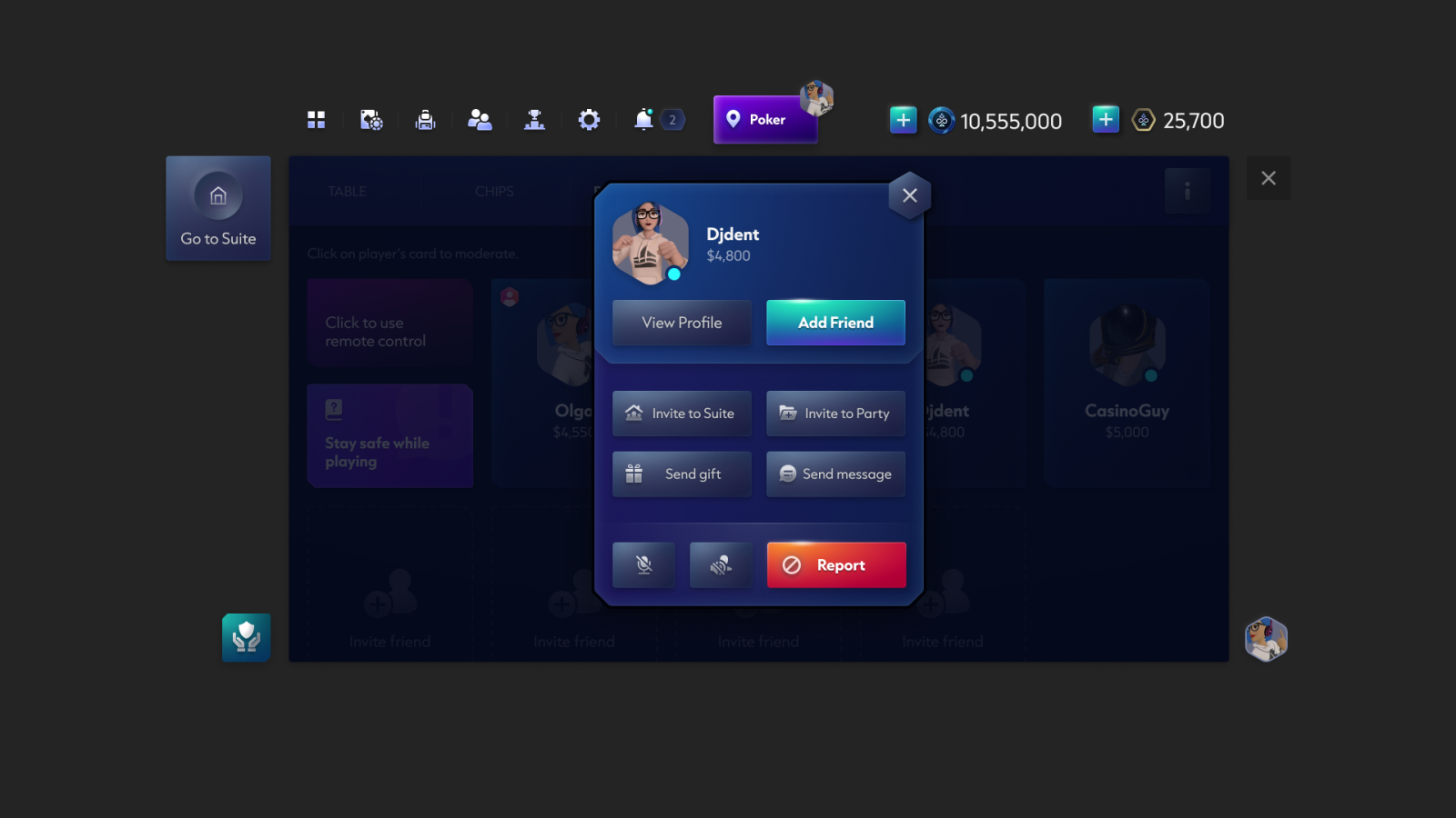
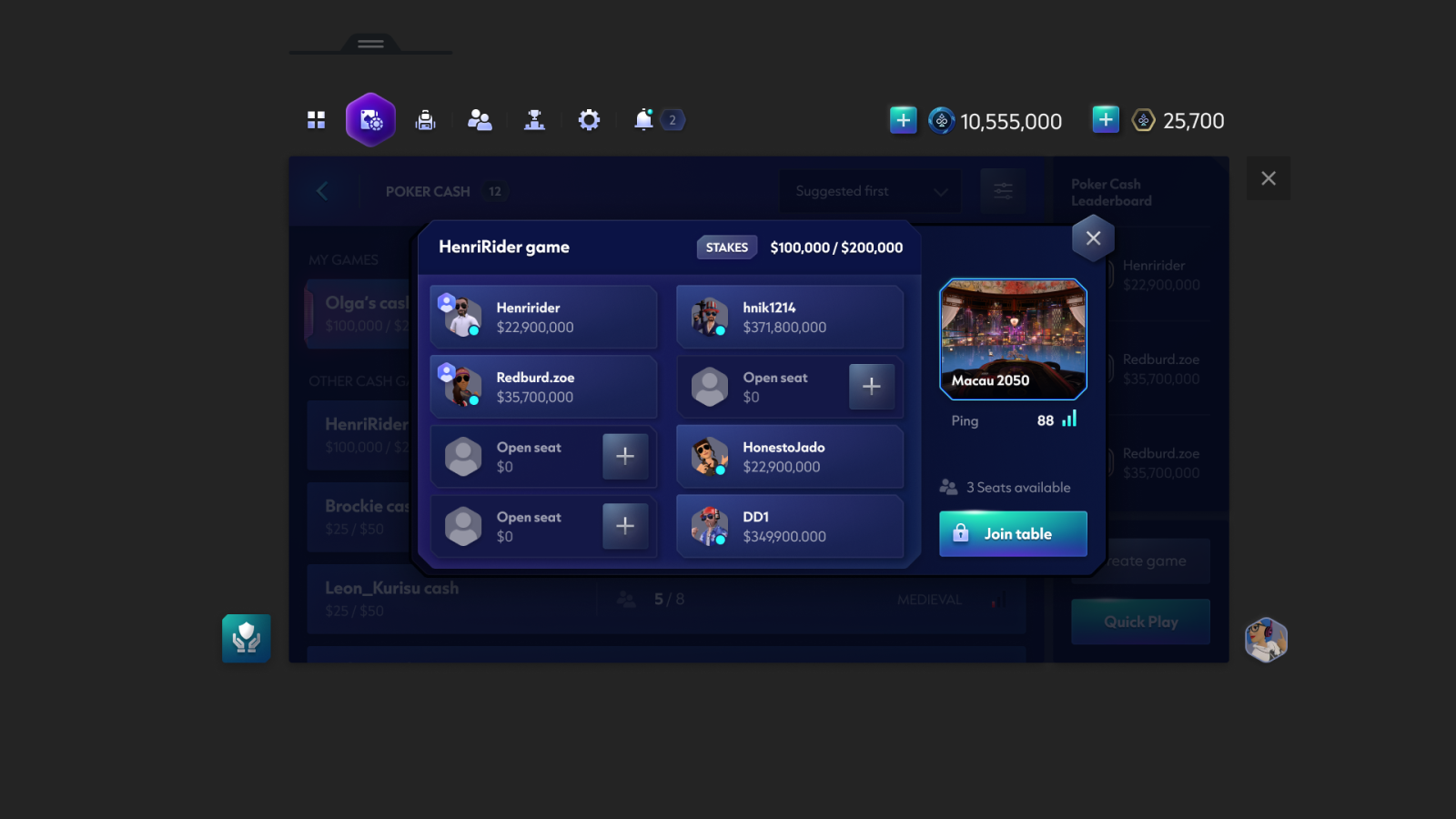
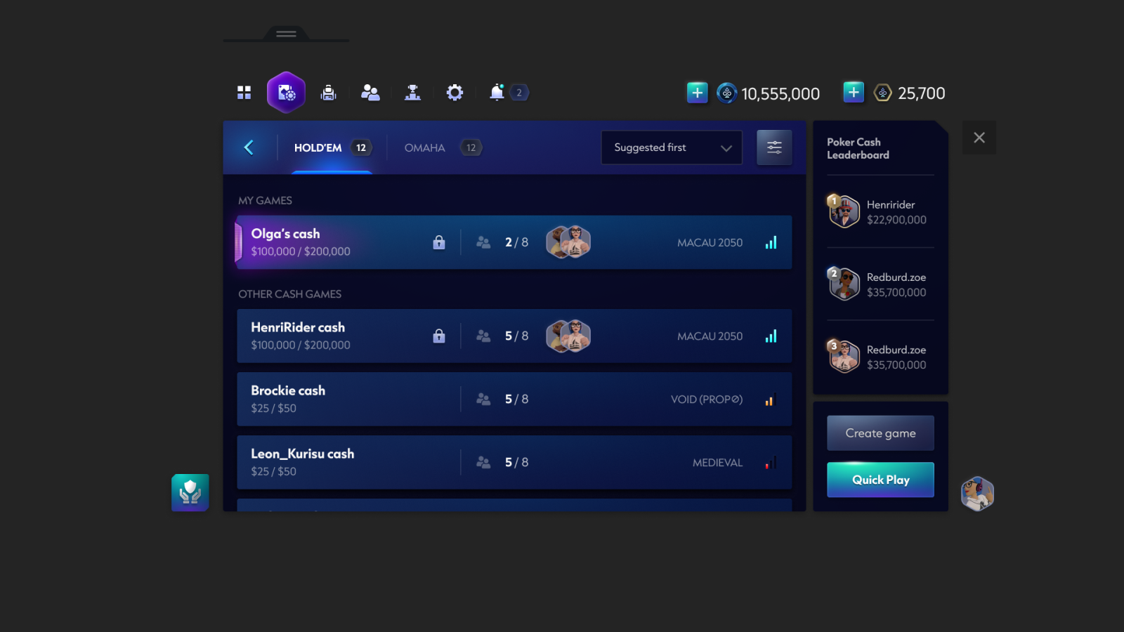
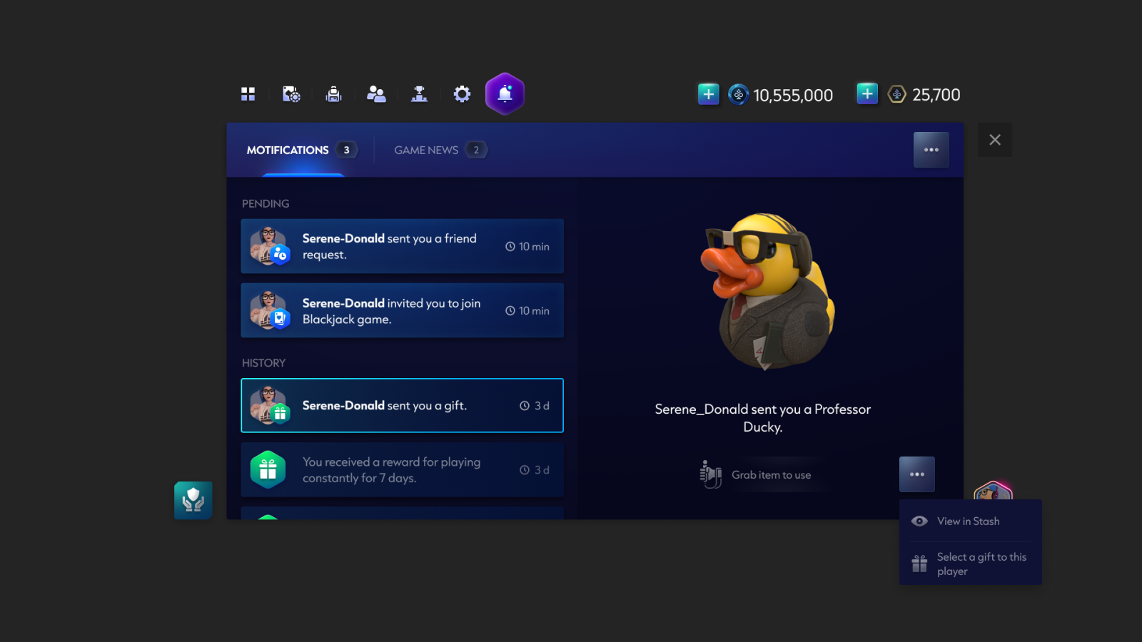
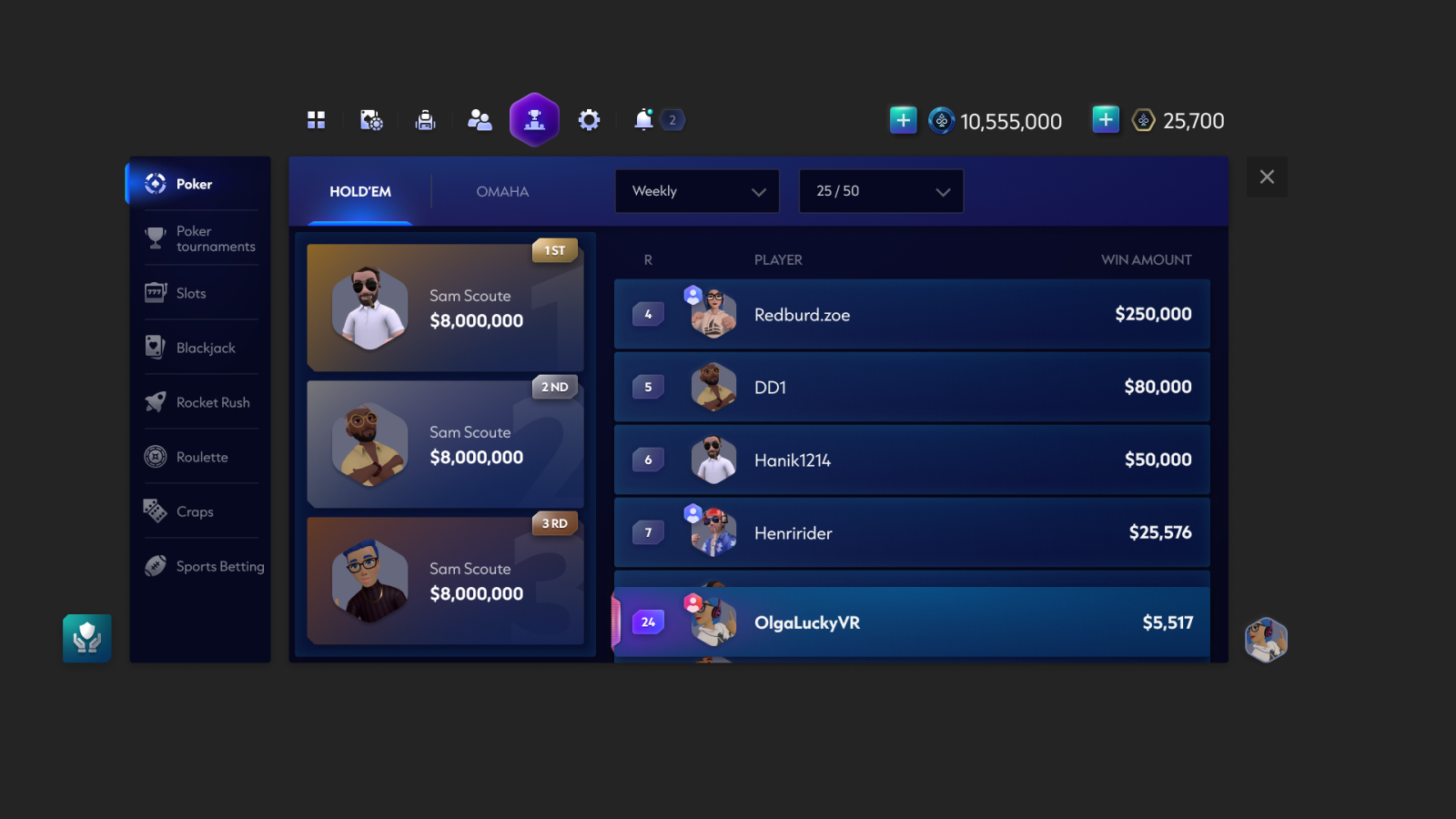
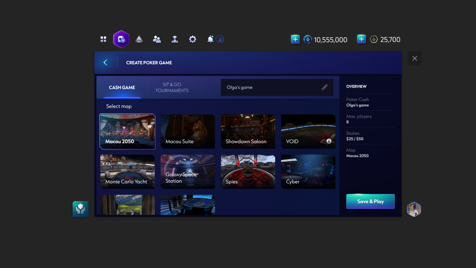
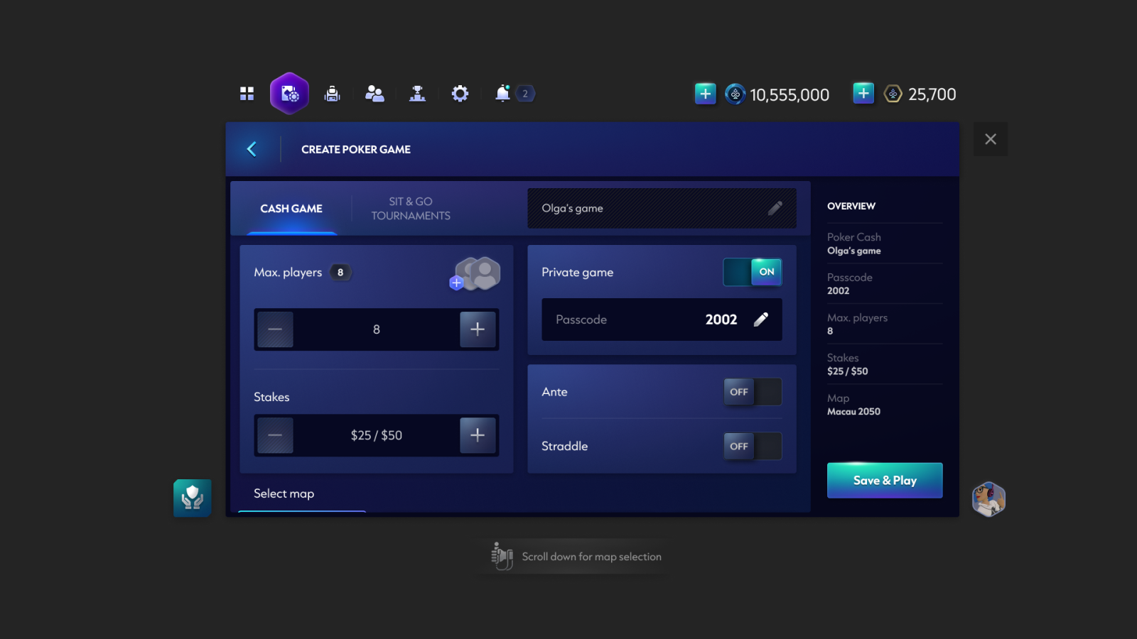
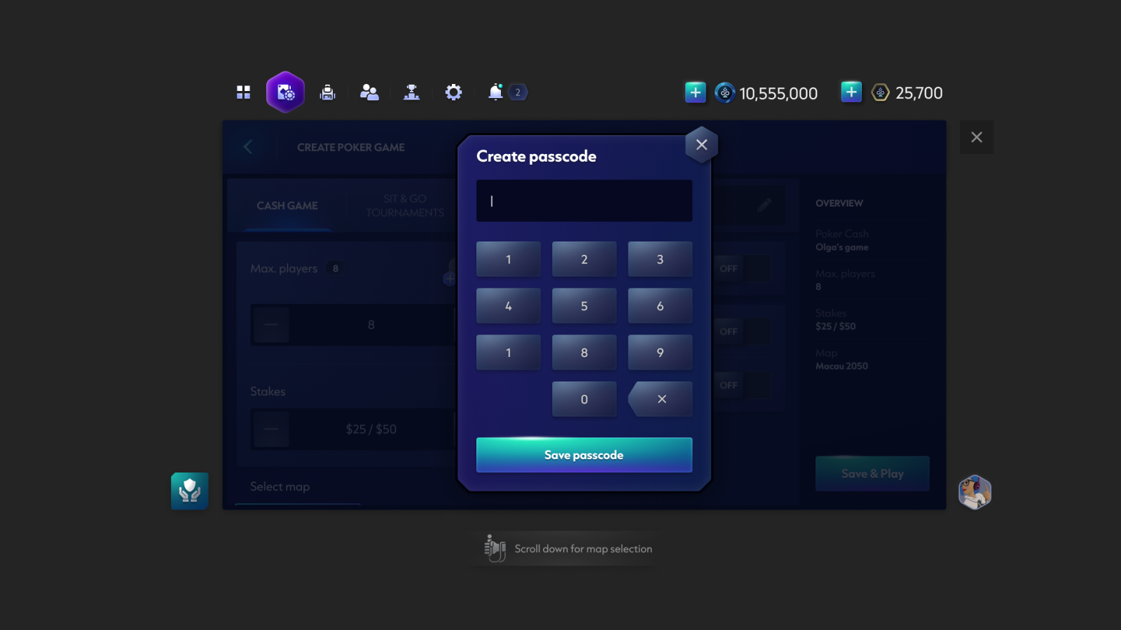
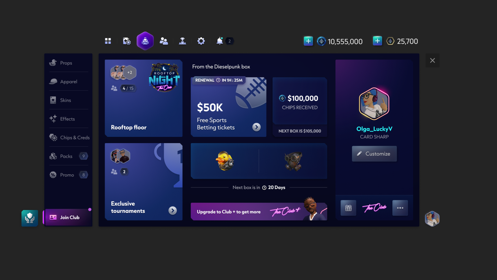
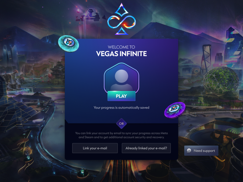
UI Screen Designs
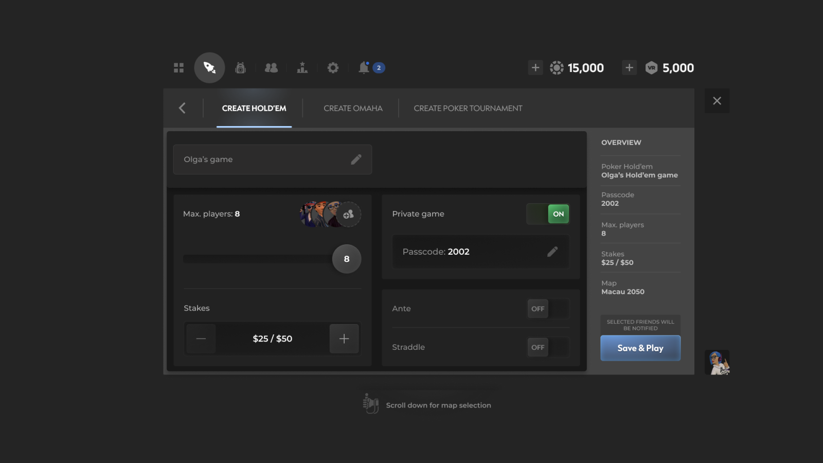
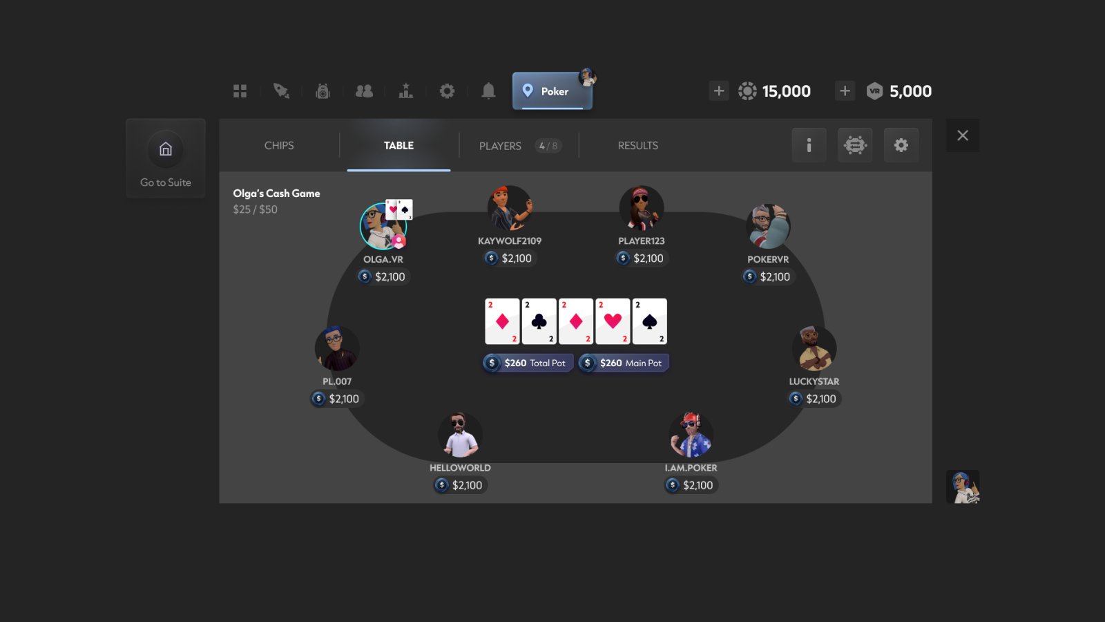
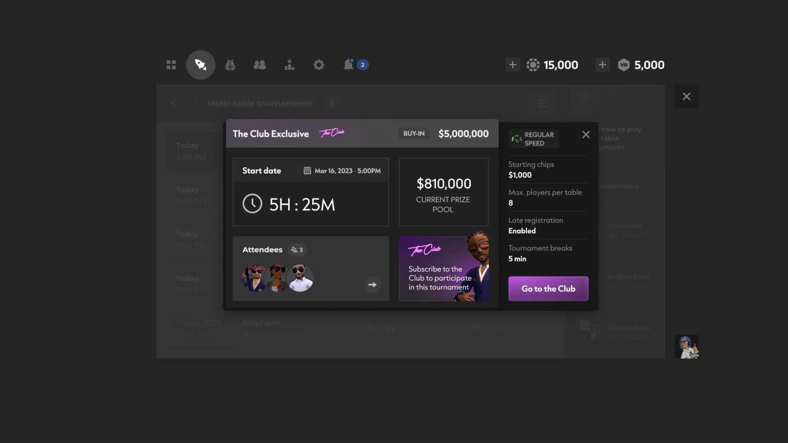
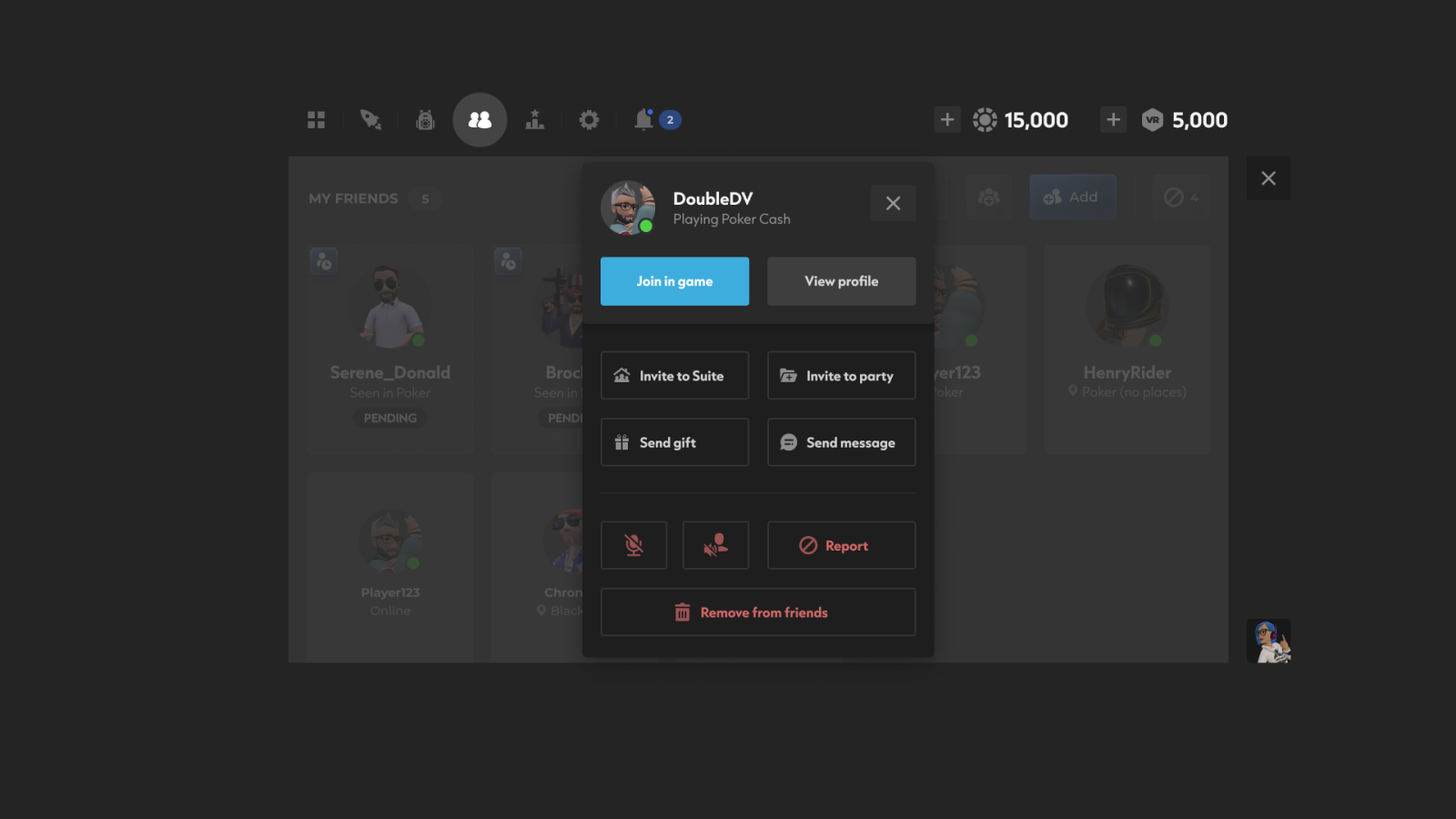
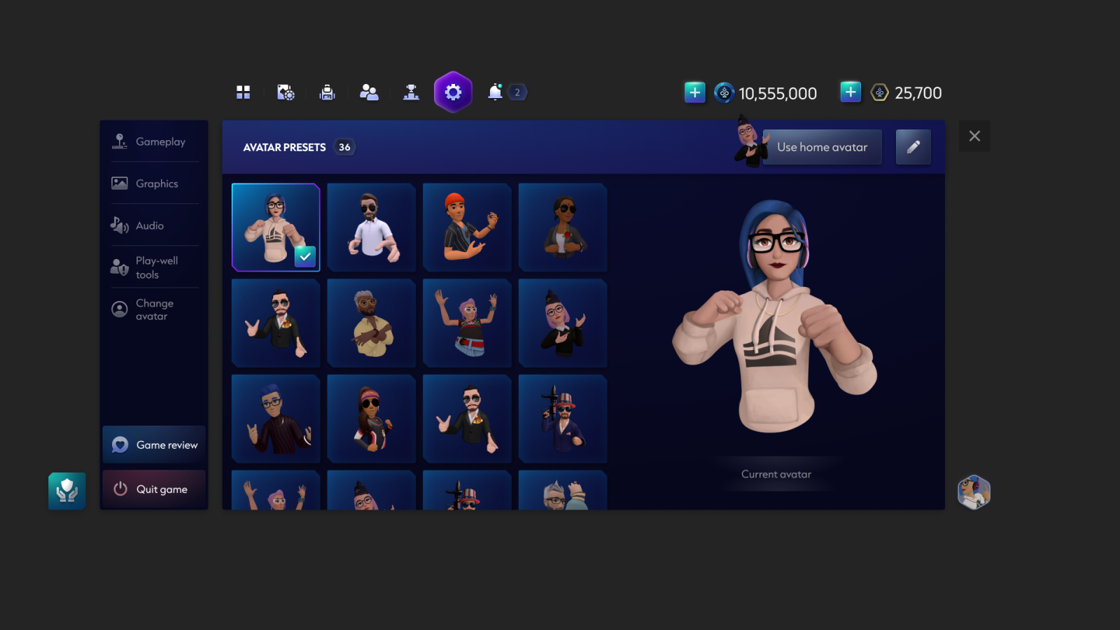
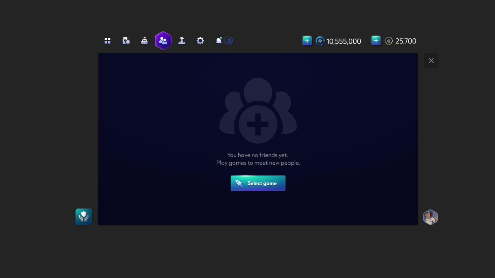
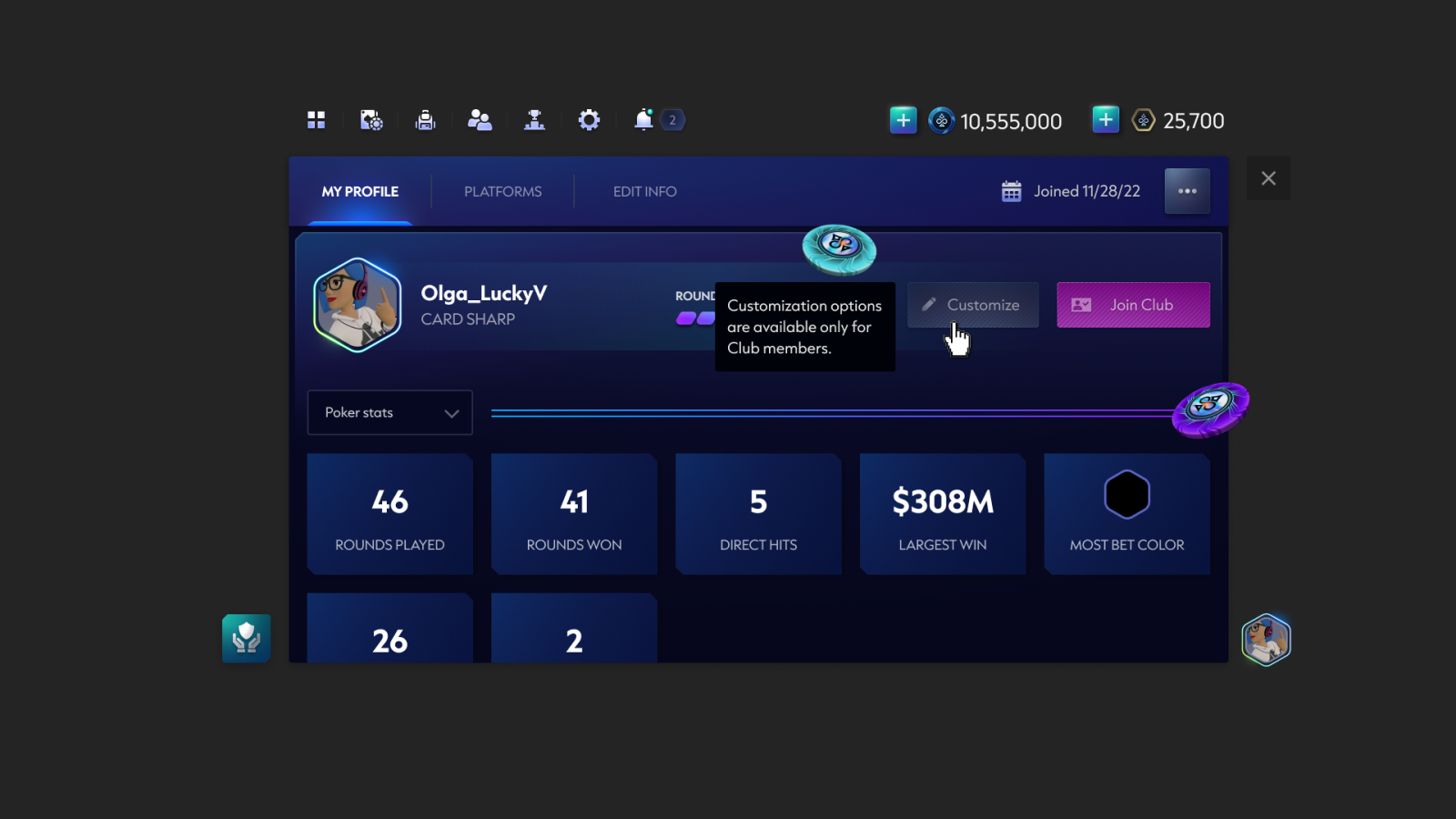
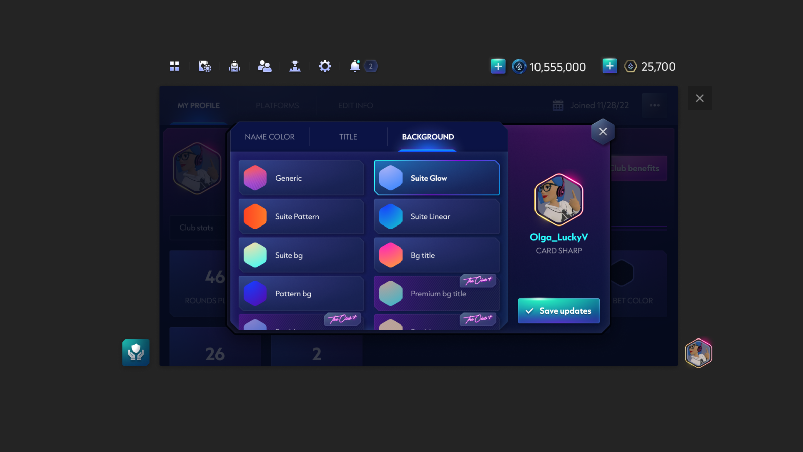
Some of the final designs created in Figma.

Next: Onboarding & VR Tutorial
Designing UI for onboarding, and the first-time user tutorial.
